Statement of Intent:
For this project I am aiming to show off my creativity and ambition through the theme of Low Light which I am extremely excited to begin. After I have completed my coursework I will be picking the best images and presenting them in my final gallery after improving and experimenting with them in Photoshop.
For my initial research I will be researching 3 very famous and interesting photographers. A photographer I have taken much interest in is Liam Wong. I love his work and how he exposes the inner beauty of Tokyo and is able to show the world how pretty it is. I will also be doing this as I wish to go around Manchester taking pictures of sights and showing the inner beauty of low light in Manchester. I wish to use his work for inspiration and match my work with his. I will also be researching Bill Schwab’s who focuses on landscapes of urban and peaceful areas. I would also like to use his techniques and edit my work how he does with the different techniques and making them have different low lights. This is similar to Jan Staller who creates surreal images, his techniques are immaculate and his eye for taking pictures is of the highest standards which I am hoping to also achieve. He focuses on things a person could see everyday yet manages to make them look so intriguing and artificial yet natural. I love how he is able to do this. These photographers are going to be my inspiration.
When I first chose this theme my initial thoughts were to only take street pictures with the outside weather and the street lamps but now having done my research I realise that there is so much more to low light. I could do man-made items in low light and photograph them or I could do natural shots where I take pictures of the things I see. I can also take pictures of the sky which is something that I am very fond of doing.
I will be completing majority of my shoots outside of school as it will be more convenient and flow better as there is not much I can take pictures of in school. Whereas outside of school I will be able to go out and take pictures of things that correlate to my theme and catch my eye, this will be a more professional approach to my exam.
Due to the fact that I will be taking pictures outside of school I will mainly be using my phone camera for most of my pictures. I am going to be experimenting with different types of settings and focusing the light and increasing and decreasing the exposure, ensuring I am able to experiment with my pictures and improve my skill of taking pictures.
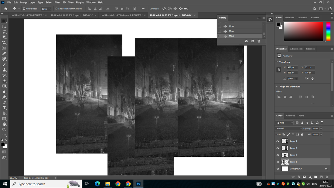
As my project progresses I will use snips and screen grabs throughout my web page of developing my images further in Photoshop and I will also be labeling my ideas and development clearly. This will also help me to reflect on the work I produce and help me to improve areas that could be better.
As I journey through my project I will use annotations and refining my work as I go over it. I will make sure to show where I liked or disliked something and critique my own work as well as getting others around me to help. I will also watch tutorials and demonstrations and find my own as well to help me develop my skills and knowledge of Photoshop.
For my initial research I will be researching 3 very famous and interesting photographers. A photographer I have taken much interest in is Liam Wong. I love his work and how he exposes the inner beauty of Tokyo and is able to show the world how pretty it is. I will also be doing this as I wish to go around Manchester taking pictures of sights and showing the inner beauty of low light in Manchester. I wish to use his work for inspiration and match my work with his. I will also be researching Bill Schwab’s who focuses on landscapes of urban and peaceful areas. I would also like to use his techniques and edit my work how he does with the different techniques and making them have different low lights. This is similar to Jan Staller who creates surreal images, his techniques are immaculate and his eye for taking pictures is of the highest standards which I am hoping to also achieve. He focuses on things a person could see everyday yet manages to make them look so intriguing and artificial yet natural. I love how he is able to do this. These photographers are going to be my inspiration.
When I first chose this theme my initial thoughts were to only take street pictures with the outside weather and the street lamps but now having done my research I realise that there is so much more to low light. I could do man-made items in low light and photograph them or I could do natural shots where I take pictures of the things I see. I can also take pictures of the sky which is something that I am very fond of doing.
I will be completing majority of my shoots outside of school as it will be more convenient and flow better as there is not much I can take pictures of in school. Whereas outside of school I will be able to go out and take pictures of things that correlate to my theme and catch my eye, this will be a more professional approach to my exam.
Due to the fact that I will be taking pictures outside of school I will mainly be using my phone camera for most of my pictures. I am going to be experimenting with different types of settings and focusing the light and increasing and decreasing the exposure, ensuring I am able to experiment with my pictures and improve my skill of taking pictures.
As my project progresses I will use snips and screen grabs throughout my web page of developing my images further in Photoshop and I will also be labeling my ideas and development clearly. This will also help me to reflect on the work I produce and help me to improve areas that could be better.
As I journey through my project I will use annotations and refining my work as I go over it. I will make sure to show where I liked or disliked something and critique my own work as well as getting others around me to help. I will also watch tutorials and demonstrations and find my own as well to help me develop my skills and knowledge of Photoshop.
Mood Boards:


Coggle:
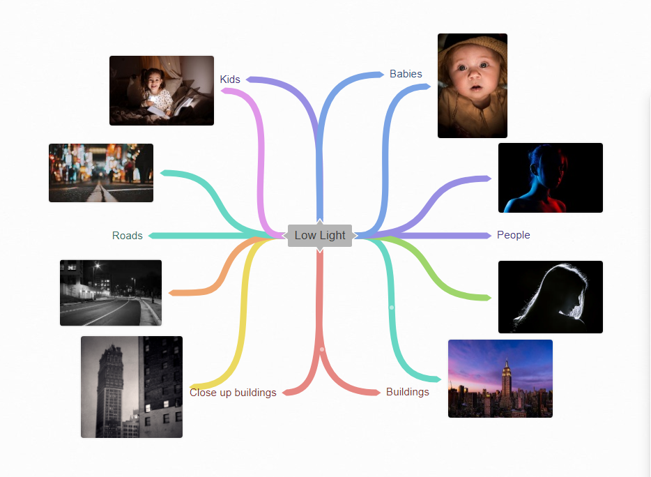
For my initial ideas I am looking at 6 different areas, but I am drawn towards buildings and roads. I will start with these two ideas on the start of my photograph journey.
Bill Schwab:
Composition:
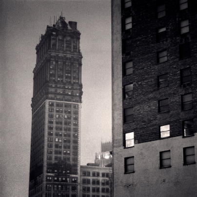
This image was taken in portrait but cropped to be square. In this image I like how the building in front has the lights off in most of the windows but the two that have the lights on show a big light contrast between the black of the window and the grayish white colour of the rest of the building. Its almost as if the windows in the building have been cut out to only see the background (the sky) as they share similar tones. I like how there is an old building in the front of the image and then a new building in the back comparing the different beauties of age. It is clear that the image has been edited further too make it look as though the image was sketched. The image has been taken from above eye level and has been tilted upwards. The picture has been tightly cropped and cut off half of the building at the front it was smart of Bill to do this as it makes a person wonder how big the building really is and makes the viewer question so many things. The angle that this image was taken at makes the building in the back tilted to the right and look as though it is falling and going to land on top of the building to the side of it.
Connection:
Using the same techniques as Bill Schwab I am going to edit my photos to make them black and white as I feel inspired by and give it that textural effect as I really admire what is presented. I also like how in the picture there is a main object that attracts the eye and in the future I would also like for my pictures to have the same image portrayed as I would also like for there to be a main feature in my images. I also like how the image has been tightly cropped so that what we see cannot be distracted by other things in the background as if there is a specific direction we are being told to look in.
Context:
"Bill Schwab’s career as a photographer and publisher now spans over 4 decades with work in many private, corporate and museum collections around the world. He has been a pioneer in the area of online representation and branding of his photographic art having successfully managed a worldwide collector base for many years as well as consulted with other artists and galleries on the subject. In addition to his work as a photographer, through his North Light Photographic Workshops, he facilitates classes in several photographic process a year at his northern Michigan facility as well as leads expeditions of photographers to Iceland, the Faroe Islands and more. Bill is also founder and host of the "Photostock Festival", an annual gathering of photographers, collectors and enthusiasts for workshops, reviews, presentations and demos. "
http://www.billschwab.com/biography/
http://www.billschwab.com/biography/
Comment:
I like Bill Schwab's work as I feel his work really catches the eye and his pictures send a different message. I like the texture of the image mainly as it really makes the picture look as though its fresh out of the 60's. One strength that I could easily point out about the image is the fact that it looks less like a picture and more like a pencil drawing.
Liam Wong:

Composition:
I really like how this image was taken during the night as I feel that the image being taken at night really enhances the blue colour and makes it stand out more to the eye. The colours are mainly blue but we can see hints of green on the train passing by and so your eye is drawn to that colour. I can also see a hint of red on an up white post and on the sign in the top left hand corner which stands out from the blue. I would say that this image has been taken at an eye level and I think that by doing this the photographer has truly captured the beauty of this view. In this image they have used a rule of thirds splitting the image into 3 sections and the bottom section is the main one. The lines going across from the left to the right. The 3 sections start from dark at the top and gradually get lighter. It looks as though there is a white line going through the page creating a pattern of white and blue. The three gaps of lights then go up half way through the picture and have a leading line going up but getting cut off and then continuing again. There is also a line going down the picture almost making the two sides symmetrical. The man in the picture is stood between the centre of the line showing how he has also been split into half of either side of the image. This man has also been scaled down and makes the vastness of the city look as though it is looming over him. The image has multiple shades of blue which all blend well with each other and the white lights highlight a different aspect to the image. You are unable to see the darkness of the night sky in this image as it has been blocked by the buildings and even the sight of sky that you can see looks like a light shade of black. However there are strong horizontal lines of white light from the train, the overhead lights and the lit windows above that punch through the blue and black of the urban night. For me the image has strong compositional techniques and the strong leading lines that make up the symmetry of the image.
Connection:
I am going to use his techniques as in my mind I would like to take pictures of many different things like buildings and nice scenery's and I want to edit them in two ways one way being with vibrant colours and exposing the inner beauty of places but I also want to edit my images and give them a special vintage look which I really admire. I really like how he captures the views of tokyo as that is something that I also want to do.
Context:
Born and raised in Scotland - within two years of graduating, Wong moved to Canada - becoming the youngest director at Ubisoft, the video game company behind Far Cry and Assassin’s Creed. In parallel with his blossoming career in video games, Wong was teaching himself photography.
In December 2015 he purchased his first DSLR (a Canon 5D III) and his debut photo series: 'Tokyo Nights (TO:KY:OO)’ - capturing the beauty of night through moments after midnight - inspired by sci-fi, neon-noir, cyberpunk and Japanese animation - gained over a million views worldwide, accumulating a following online and kickstarting his journey into photography. Wong has since collaborated with many high profile companies, artists, musicians and directors. His work has been recognized by media outlets such as BBC, Forbes, Business Insider, Saatchi and Adobe.
In December 2015 he purchased his first DSLR (a Canon 5D III) and his debut photo series: 'Tokyo Nights (TO:KY:OO)’ - capturing the beauty of night through moments after midnight - inspired by sci-fi, neon-noir, cyberpunk and Japanese animation - gained over a million views worldwide, accumulating a following online and kickstarting his journey into photography. Wong has since collaborated with many high profile companies, artists, musicians and directors. His work has been recognized by media outlets such as BBC, Forbes, Business Insider, Saatchi and Adobe.
Comment:
I enjoy looking at Liam Wong's work as I find the streets of Tokyo very interesting and filled with messages which I think that Liam highlights in his work all the time. In this particular image it is the man waiting for a train and is all alone in this city I think that this resembles a lonely man who is in such a big city going by his day in his normal routine yet still feels isolated and is simply just waiting for someone of something to come by and change his life for the better. I also love how he exposes the inner bright city of Tokyo and shows its vibrant colours. He shows the inner beauty of the city. The lights contrast with the darkness of the city and brighten it up with the purity of their white light.
Jan Staller:

Composition:
The Photographer has used the rule of thirds to take this picture the first third has been taken to look darker as has the third bottom but the second third has been lit up by the street light. It is evident that the image has been taken at eye level to enhance the white pureness of the snow which contrasts with the darkness of the trees. The fog creates a misty blurred look which helps to make the image look cold. The photographer used a depth of field to make the tree look close but then got further away as the image went on. This image consists of fluffy porcelain snow which is closer to the view surrounded by the trees and shadows. There is also a traffic light present at the back which appears to be red and smaller than the tall dark trees. The image seems to have been taken at a much more modern time period as it seems to have been taken on a more advanced piece of technology due to the clarity of the image. The photograph has a fair amount of colour, but not much range as there is only the white snow, the blue sky and the colour of the light along with a bright white light coming from the street light. Due to the fact that there are no animals or people in sight makes the place look quite isolated yet it is not scary but more therapeutic and soft. The use of a slow shutter speed has made it possible for the mist of the air to be captured and the rays of the lights beaming out. The photographer may have used Photoshop to crop this image and enhance the colours of the image to look much softer. Also the shadows from the bark of the tree create leading lines which point the eye to the direction of the redness coming from the traffic light
Connection:
It is evident that the theme of this image is landscapes and scenery's that capture the essence of lights which is similar to my low light project and resembles what I wish to take pictures of throughout this project. I want to take pictures like this as it captures every essence of the beauties of the winter weather. Whilst also focusing on the light I would also like to try to portray the different weather types like winter, autumn, spring and summer. I also intend on focusing on the beauty of nature throughout my work and this image has definitely been my inspiration to capture images in such a way that every little detail of the image will be intriguing and every aspect will be shown in great detail.
Context:
"Jan Evan Staller was born on May 27, 1952, in Mineola, New York, United States. Jan Staller received a Bachelor of Fine Arts from the Maryland Institute (now the Maryland Institute College of Art (MICA)) in Baltimore in 1975.For more than 35 years, Staller’s photography has traced a trajectory from uncanny urban landscapes to bold abstracted studies of industrial materials. Moving to Manhattan in 1976, Jan Staller began to photograph the world closest to his home: the West Side Highway. It was there, working with a mixture of natural and artificial light, he made his influential twilight images of New York City. Over the years, he has expanded the regions of his work." ----https://prabook.com/web/jan.staller/1720878----
Comment:
I really adore this image and can see many strengths for this image, the main aspect of this image which i quite enjoy is the colours and how they all relate too each other and then the contrast of the red to highlight some differences. It has been captured so perfectly it almost makes me feel as though I am there and the way that the photographer has captured the texture of the snow and the mist of the air helps me to imagine the weather and feel the cold. The image is beautiful and complexed as there is so much that it can tell us and so much that it shows us. Overall, I believe this image has been composed very well and send the viewer a message that sometimes the loneliness and isolation is not always a bad thing and can also be very beautiful to witness at certain times. This is presented through the isolation of the image and the sense that it was taken in winter which is only temporary as the other 3 seasons are yet to come therefor resembling that you wont always be lonely. It also shows the beauties of nature and how beautiful the cold dark winters can be. Nature is eternal unlike our human existence in this world and so we should just enjoy the beauties of our life and always find something positive out of something that is negative.

The inspiration for my next images has come from this picture taken by Liam Wong.
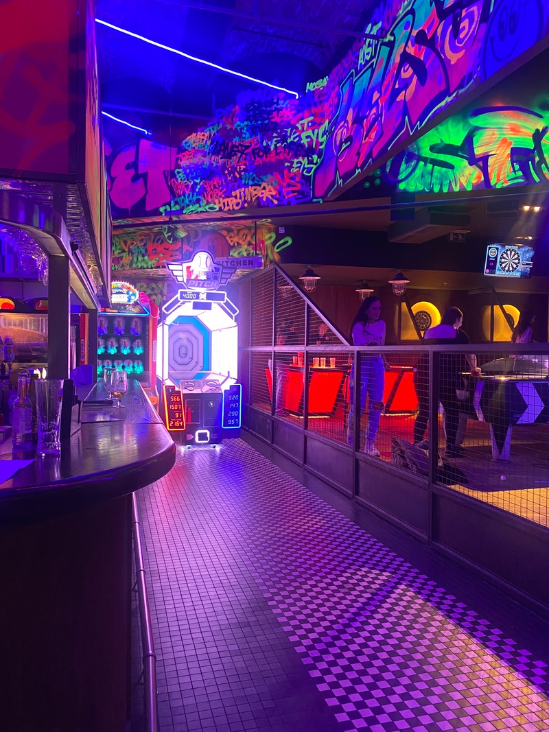
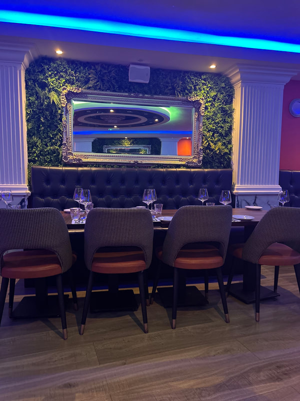
Neon Light in public places:
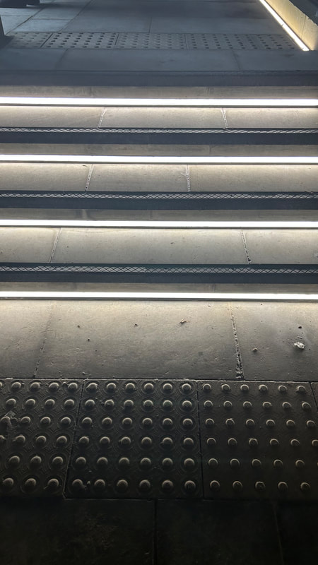
For my first Shoot I am going to go outside of school and take images. I'm going to go into Manchester and take some interior and some exterior pictures of things that attract my eye. I want to take a wide variety of different ones so that when I start to edit them in Photoshop I will have a range of them to choose from. I am going to be using the camera on my mobile phone.
|
|
|
|
WORST:
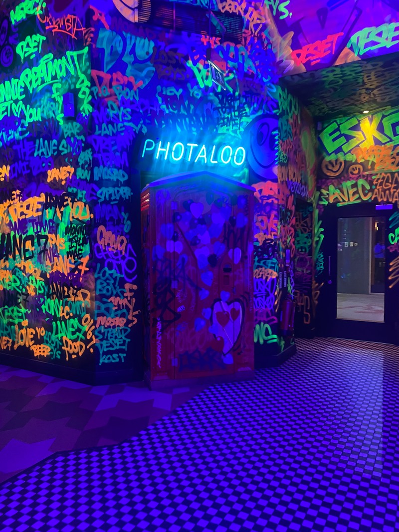
For this picture there are too many distractions and people in the way ruining the picture. BEST:
I like how this image shows the vibrant colours of the graffiti on the walls and the neon lighting. The red door is placed directly in the middle of the image making it the centre of the picture. Your eye is drawn straight to the blue lit sign which stands out from the graffiti. |
|
Outcome 1:

|

|


|
I ended up with this outcome and I thought it looked really nice and I was proud of the picture but I felt as though it was getting to neon and not relating to my theme and so I changed it back to that more softer look and I am glad I have don't this as I know it would not have fit well with my plan.
|

|

|

|

|

|

|

|

|
|
|
|
|
|
|
Shoot Plan 2:
I will be using my phone camera to take the images as I will be going outside of school to take these pictures. I will not need no models as I am not going to be involving people as of yet.
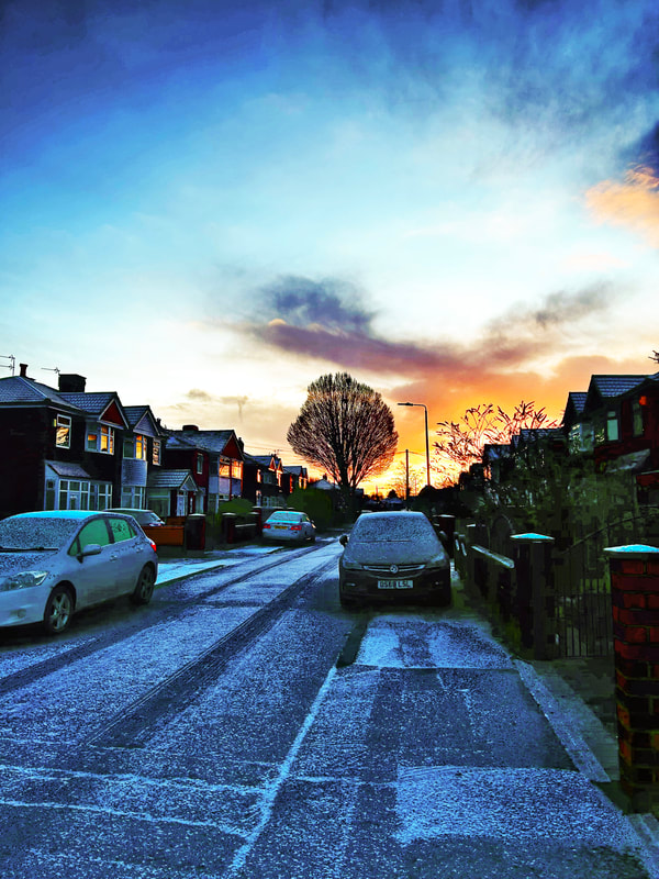
Roads covered in snow:
BEST:
I think that all of my images have been taking very well and I love how the clarity of the images are clear and the background. The image has been split into three, the foreground, middle ground and top. Each section has something different going on and could also show 3 different stories. I really like the natural lighting in these images as it is different from the neo lighting in my previous set of images.
I think that all of my images have been taking very well and I love how the clarity of the images are clear and the background. The image has been split into three, the foreground, middle ground and top. Each section has something different going on and could also show 3 different stories. I really like the natural lighting in these images as it is different from the neo lighting in my previous set of images.


WORST:
I do not really like these bottom three pictures as the bottom cuts off and there is no leading line in this image unlike the other images. The fact that it has been tightly cropped ruins the image as it looks strange that there is no bottom part to the houses .
I do not really like these bottom three pictures as the bottom cuts off and there is no leading line in this image unlike the other images. The fact that it has been tightly cropped ruins the image as it looks strange that there is no bottom part to the houses .
Outcome 2:
|
|
|


Shoot plan 3:
For this shoot I will be going to the PEXA hall to take pictures ion the dark with minimum light. To do this I will be using my phone camera and experimenting with the different shadow lights and focus points. I will be doing this solely and will then after edit these pictures in photoshop.
For this shoot I will be going to the PEXA hall to take pictures ion the dark with minimum light. To do this I will be using my phone camera and experimenting with the different shadow lights and focus points. I will be doing this solely and will then after edit these pictures in photoshop.
PEXA Hall :
BEST:
These images are the best out of the bunch as there is a clear clarity and some light shining through allowing for most of the picture to be visible. I wanted to try indoor shots and strong leading lines as this links to some of my research.
These images are the best out of the bunch as there is a clear clarity and some light shining through allowing for most of the picture to be visible. I wanted to try indoor shots and strong leading lines as this links to some of my research.


WORST:
These images are too dark and due to the colour of the walls it makes the picture look even more dark and so the image looks very random with some things being visible and others not.
These images are too dark and due to the colour of the walls it makes the picture look even more dark and so the image looks very random with some things being visible and others not.


BEST:
Out of all the images I like these images as it is more lit up and the main light source is coming from one space and brightening most of the picture but then slowly fading out.
Out of all the images I like these images as it is more lit up and the main light source is coming from one space and brightening most of the picture but then slowly fading out.


I do not like how these images came out and so I will not be developing them further. I feel like there is not much light in the pictures and there is too much darkness and the outcome does not match with my other ones which makes it looks odd.
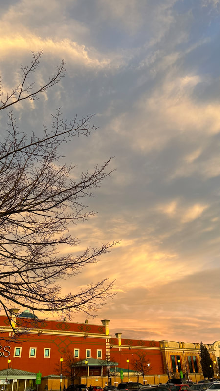
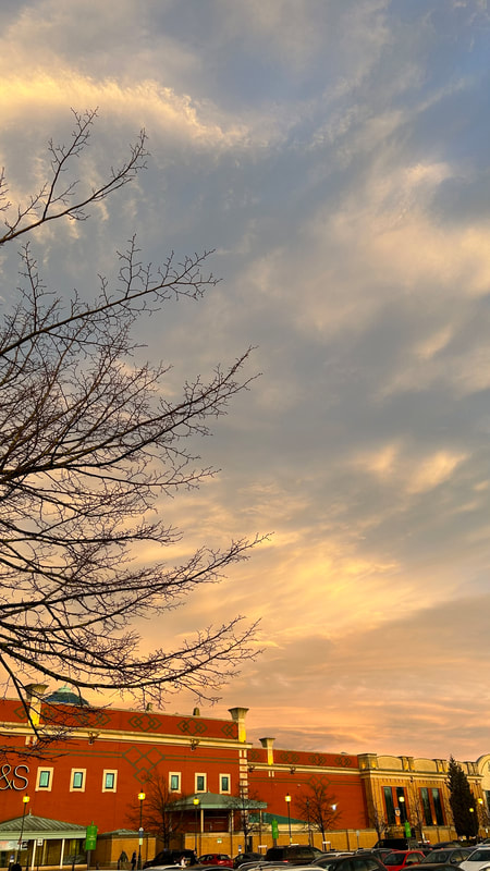
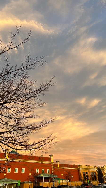
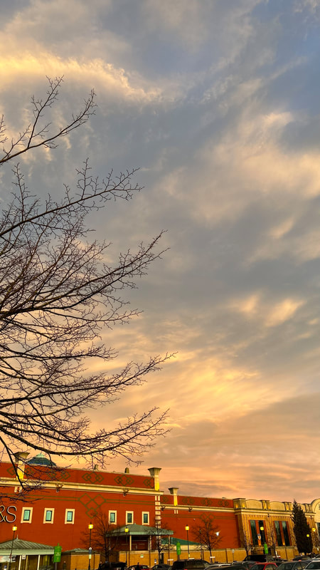
Sunset - Light Sky
I really love sunsets which is something you will be able to see throughout my whole journey. I love the skies and enjoy the view of the different patterns and colours in the sky. These sunset pictures were taken near Trafford Centre and outside my house.

|
|
|
|

|
|
Outcome 3:


I like how the sky looks like cotton candy and the image looks calm and peaceful and quiet. But I feel as though the fence may have spoilt the image a little due to its colouring and shape and position in the image but, overall, it looks relaxing.


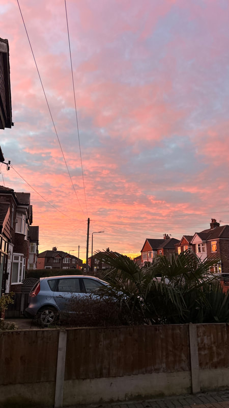


Behind the houses it looks like a fire has been lit and the sky is fiery with what looks like ash clouds and smoke. The light orangey red colour contrasts with the darkness at the bottom of the houses and the shape. If a person were too look at the image from far it would look like as though the image was a painting and not a real sighting.


Outcome 4:

|

|

|


|
|
|
I love the sky in the images and the light and dark contrasts. The lights that shine that you can see also add to the tone and set a mood in the pictures. But I feel as though the images could have been taken more straight and upright as the image looks tilted to the left. As thought its falling.
|

|
|
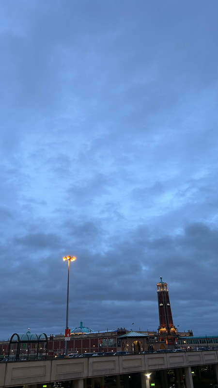
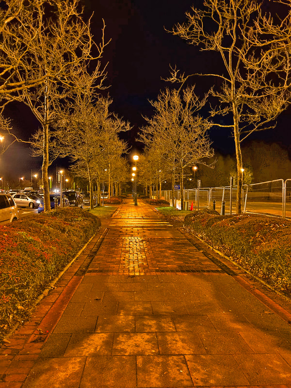
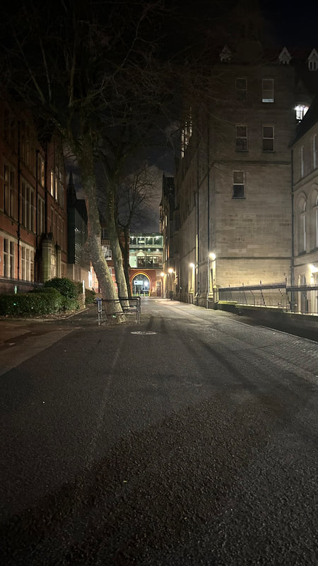
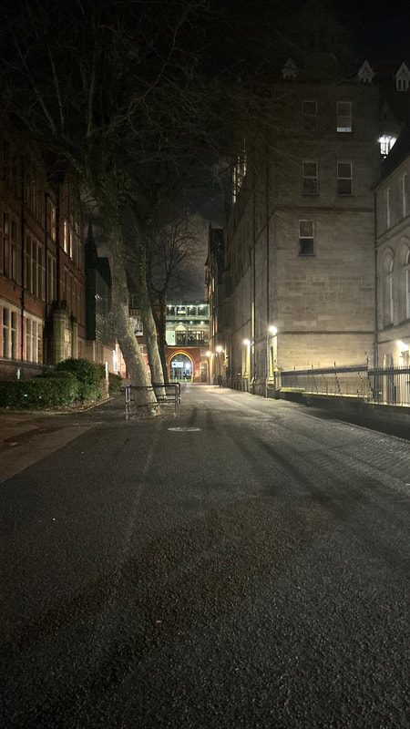
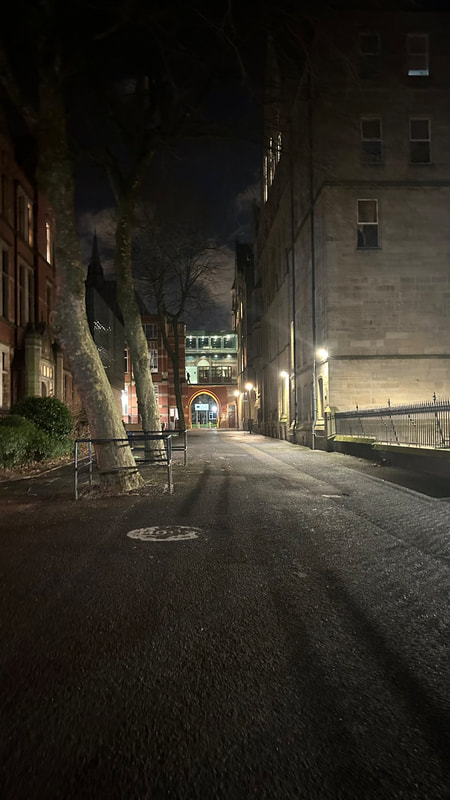
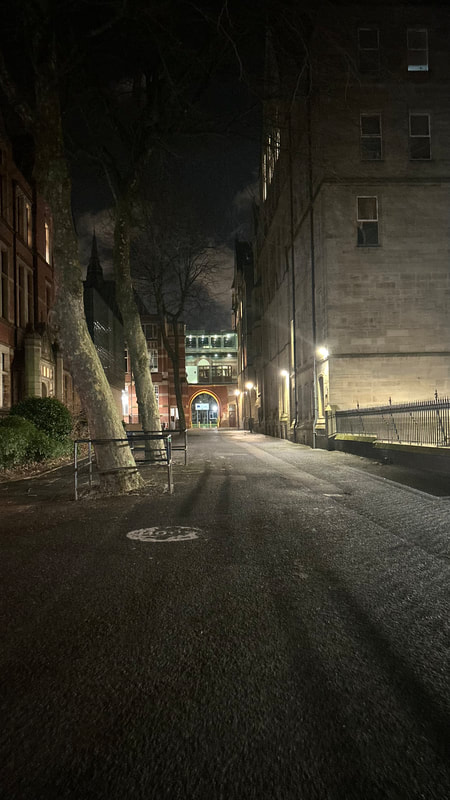
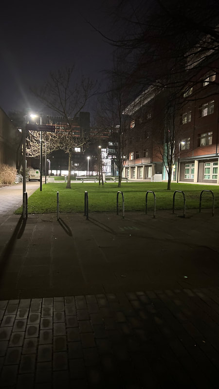
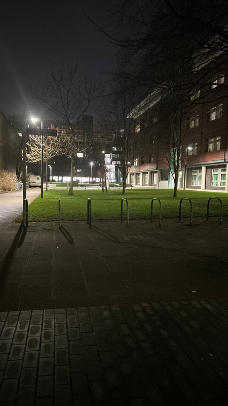
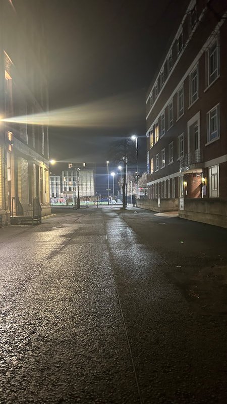
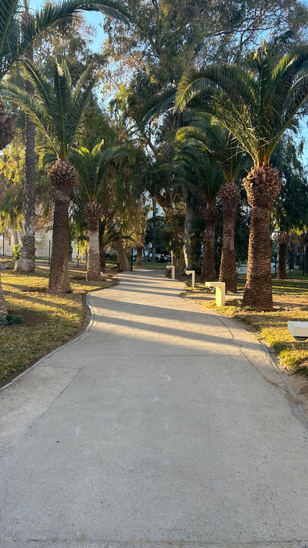
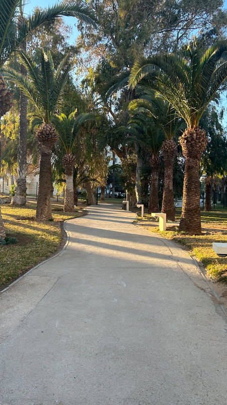
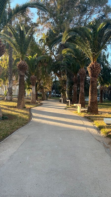
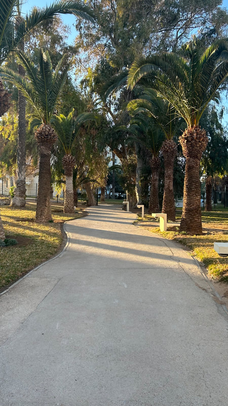
Manchester at night:
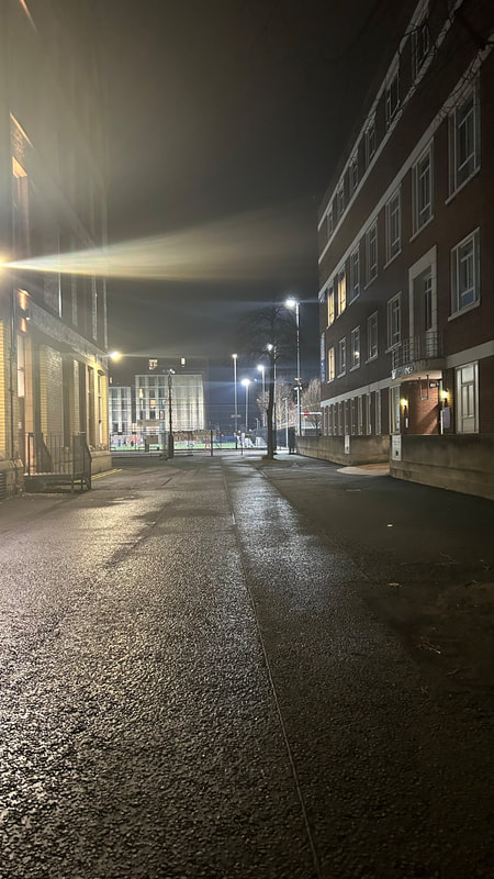
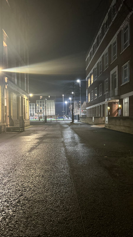
BEST:
The leading line goes to the centre where the lampposts are and it looks as though the path is never ending. The lighting is perfect and the scenery. The colours blend well together too the floor looks golden and the sky a dark navy blue.
The leading line goes to the centre where the lampposts are and it looks as though the path is never ending. The lighting is perfect and the scenery. The colours blend well together too the floor looks golden and the sky a dark navy blue.


WORST:
I don't like how the building in the back is all light and has a different colour scheme. It takes away from the picture and ruins the background.
I don't like how the building in the back is all light and has a different colour scheme. It takes away from the picture and ruins the background.
Outcome 5:


|
|
|
Shoot 6:
|
|

|

|

|

|
WORST: I don't like how the top of the tree has been cut off in these picture. |
|

|
|

|

|
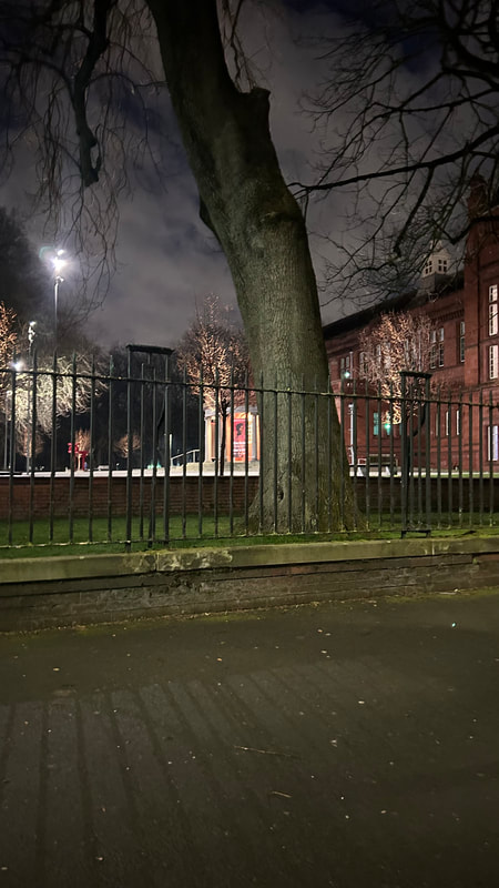
BEST:
I like how the tree looks almost inferior in this picture too the person looking at the picture and the top of the tree contrasts with the colour of the sky.
I like how the tree looks almost inferior in this picture too the person looking at the picture and the top of the tree contrasts with the colour of the sky.
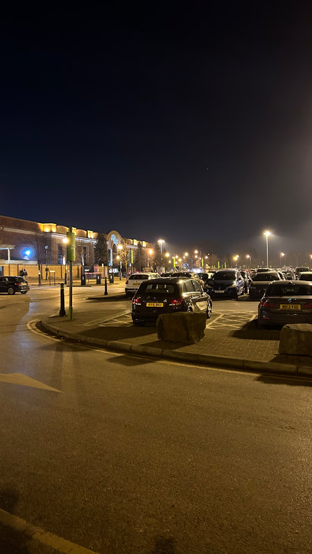
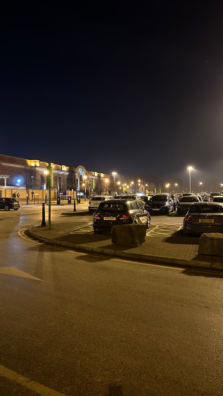
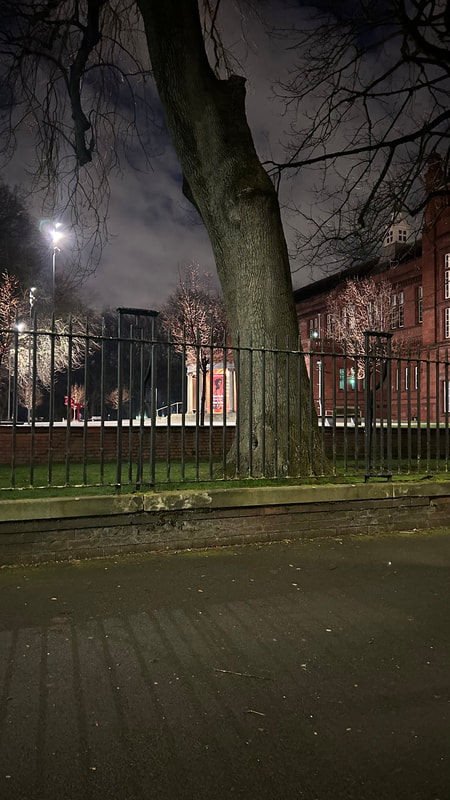
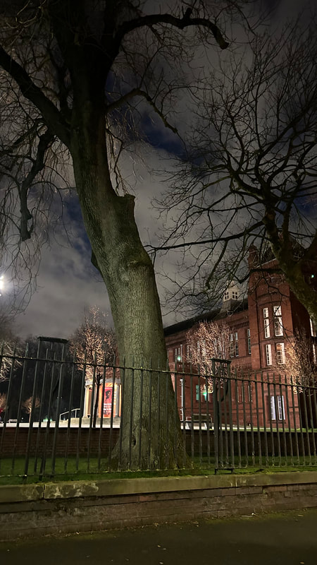
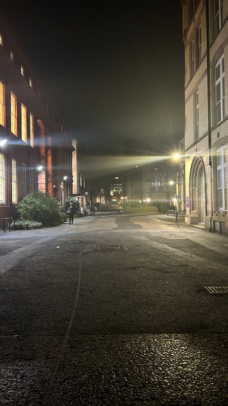
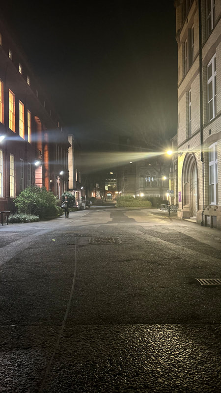
Light and dark skies contrasting with the structure of the building:
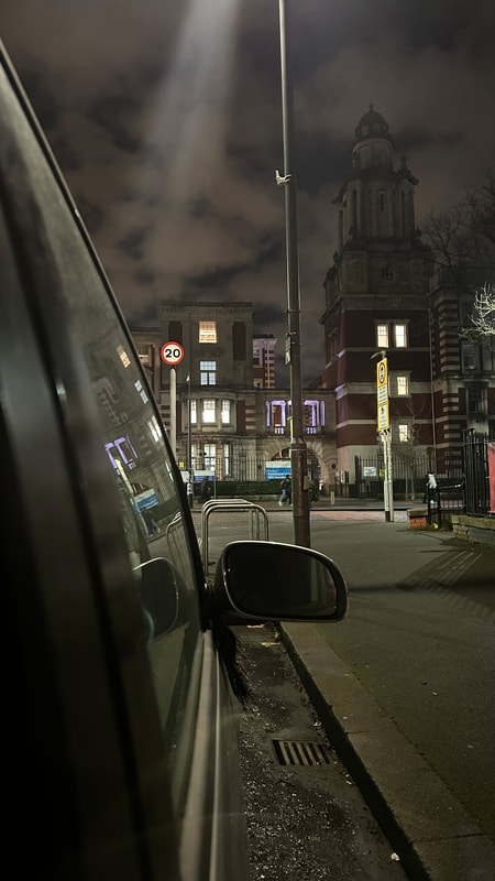
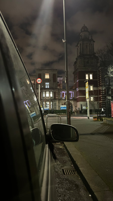
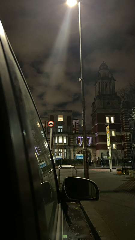
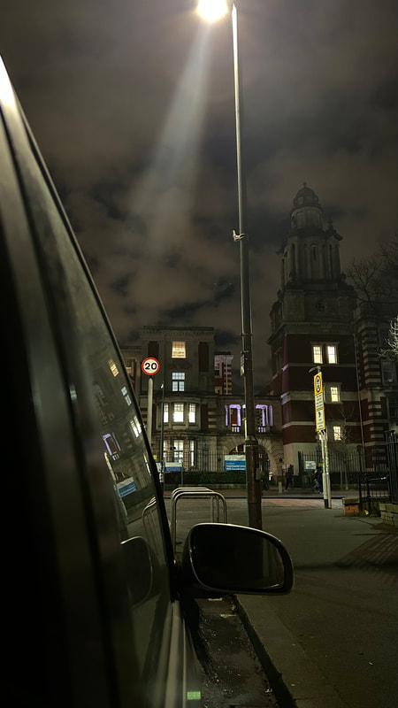
I love how the images in this section turned out and I really happy with the outcomes. Most photos were taken in town but the ones directly under were taken near Trafford centre. I'm glad I went to town as the images really show off the low light features.


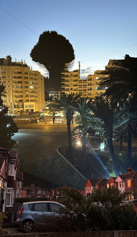
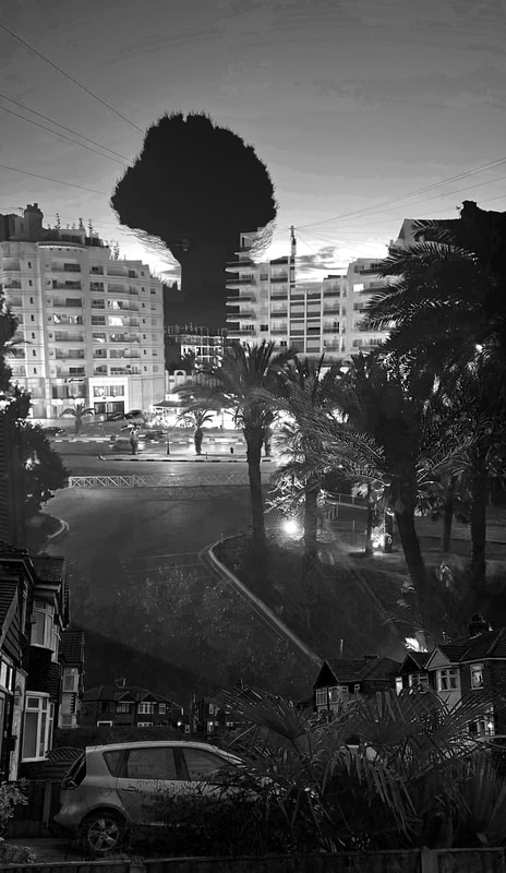
I like how the building in the background looks old and historical and the car in one half of the image shows a contrast between modern and old society. The lamppost in the middle is positioned too look like a divider between the two realities. The angelic light shining from the top looks magical. Its almost as if the sky is that greyish white colour and the blue is cracks that are breaking through the sky.
|
|
|
|
|

|
|
|
|
|
|
|
|
|
|
|

|
|
|
|
|

|
|
|
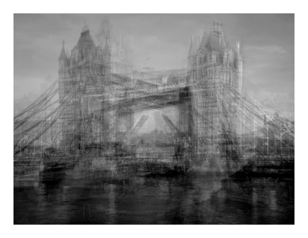
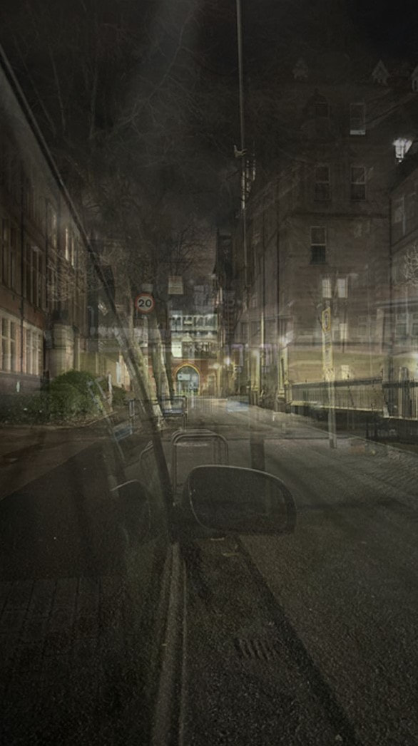
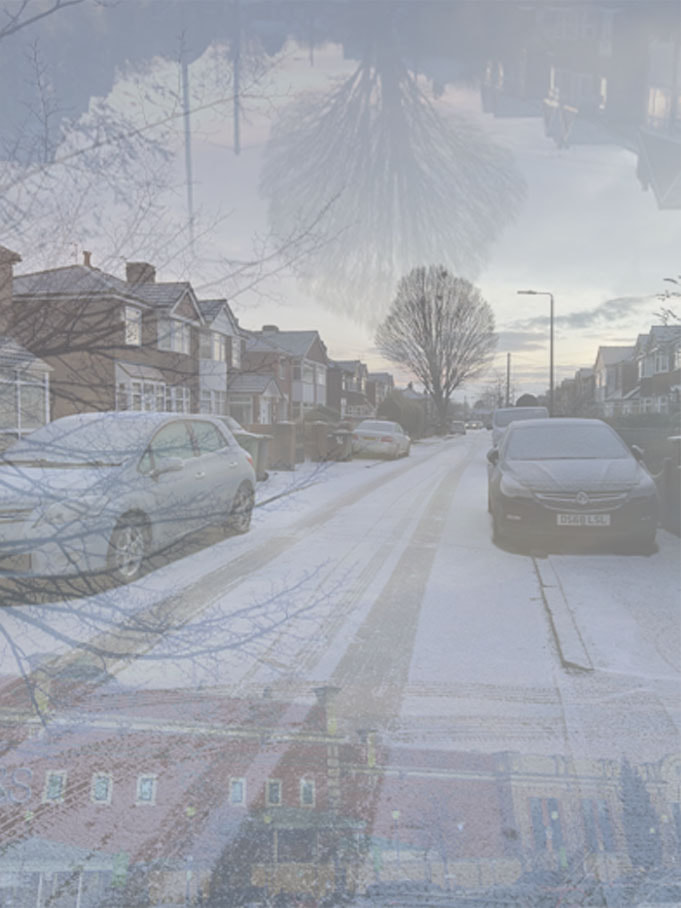
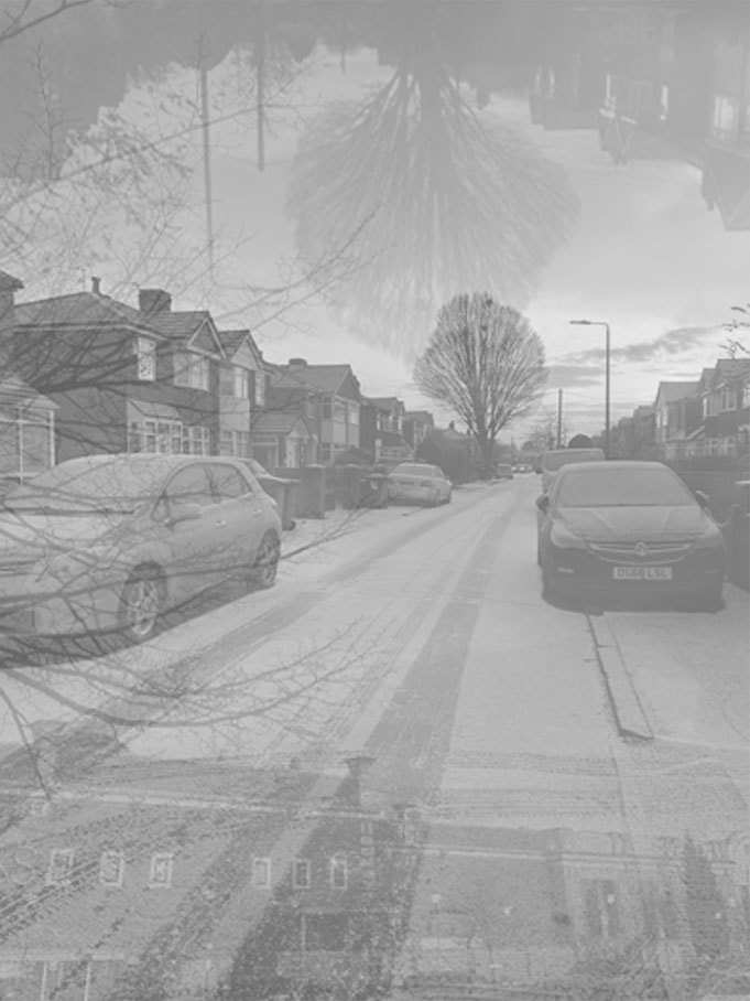
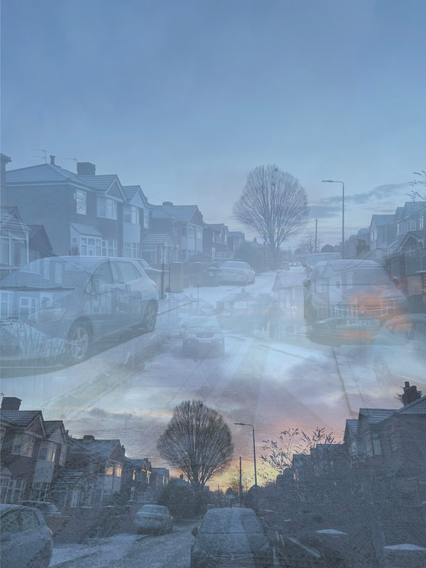
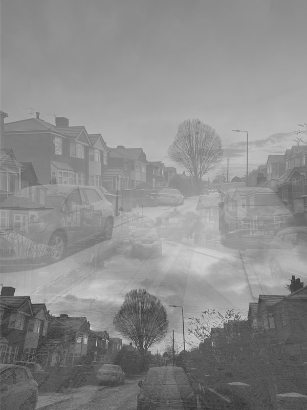
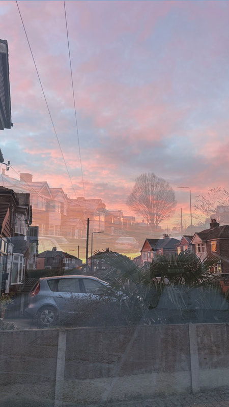
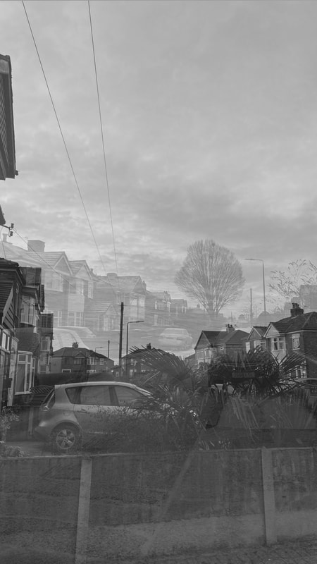
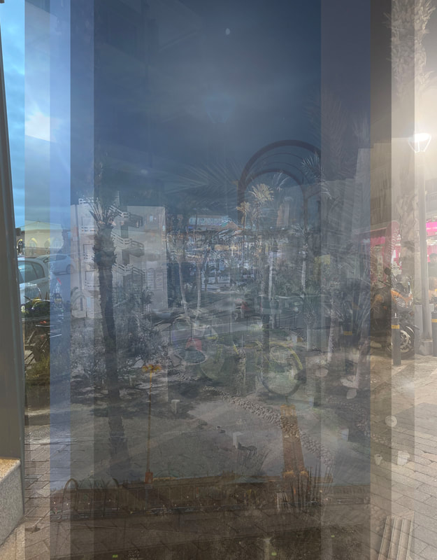
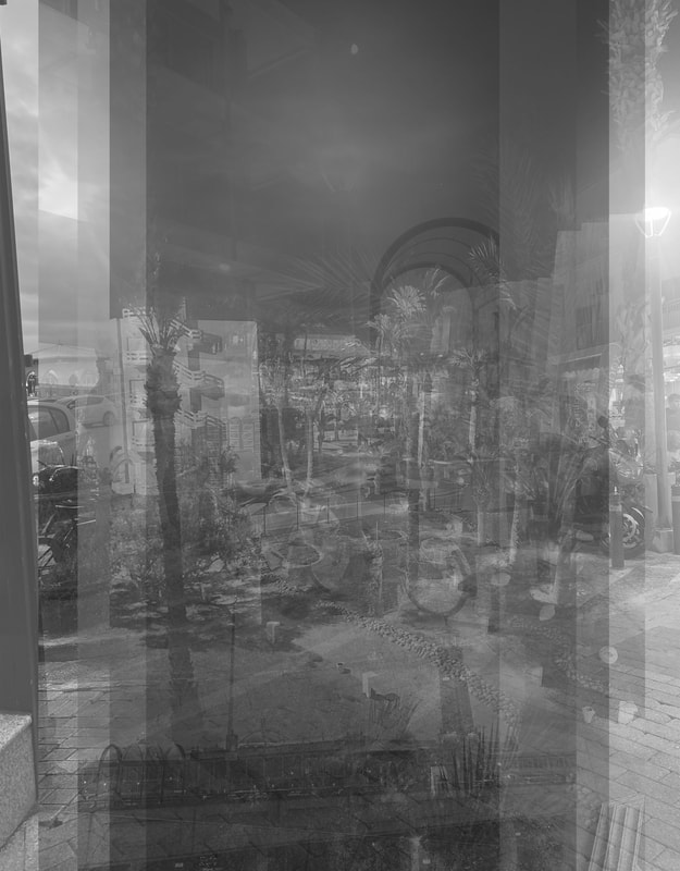
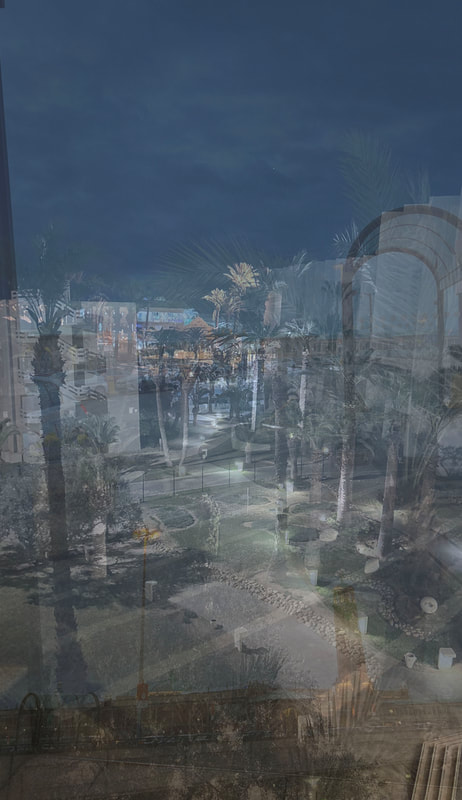
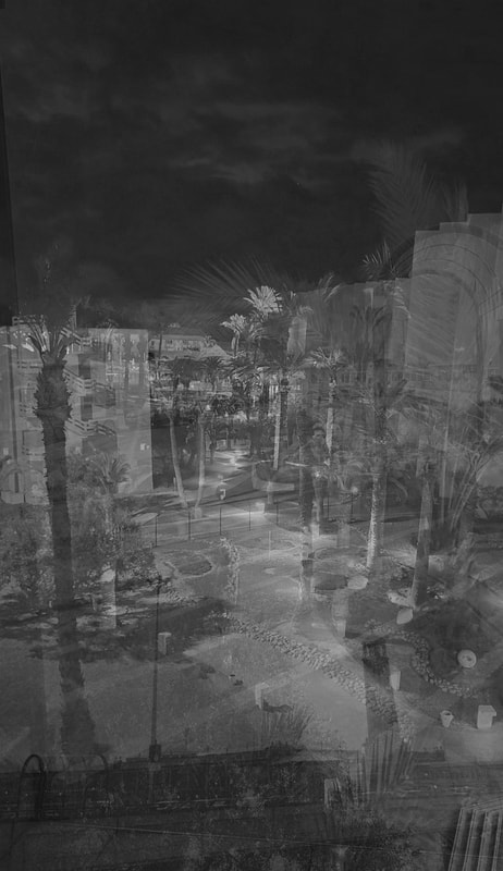
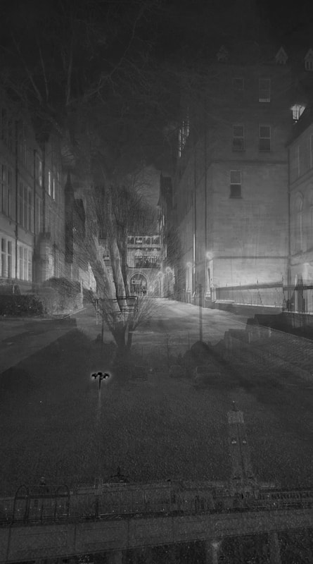
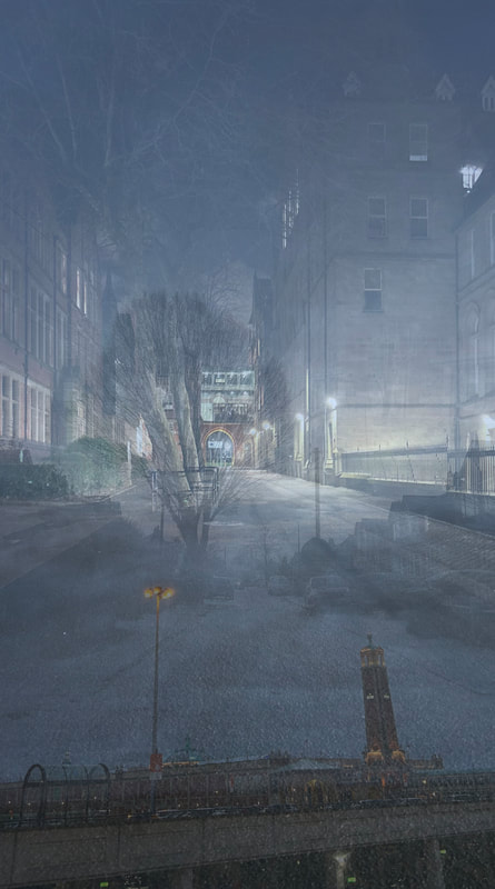
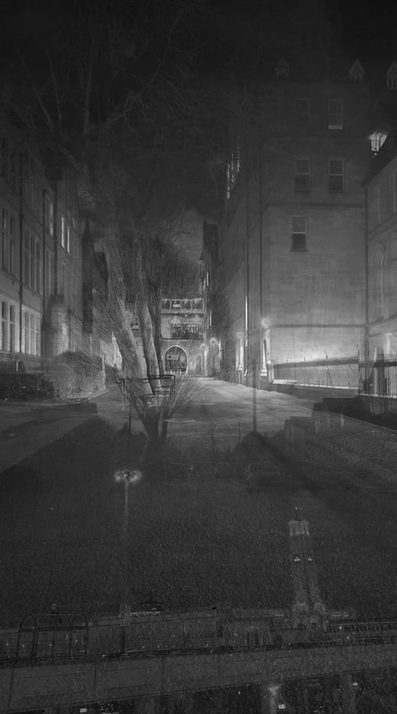
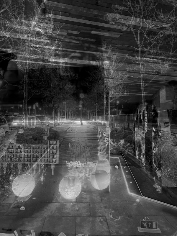
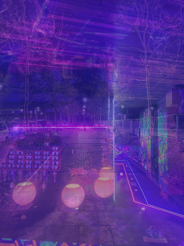
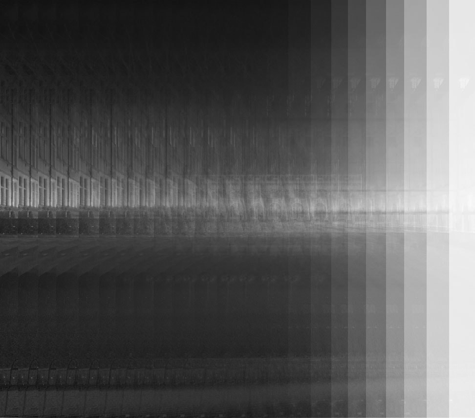
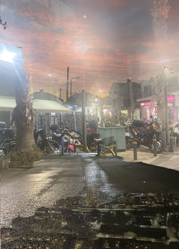
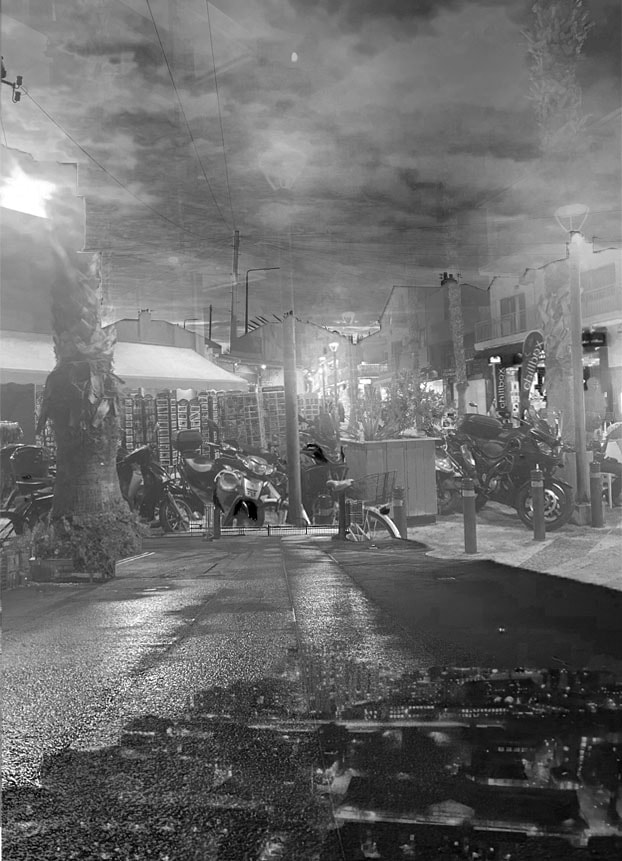
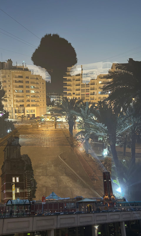
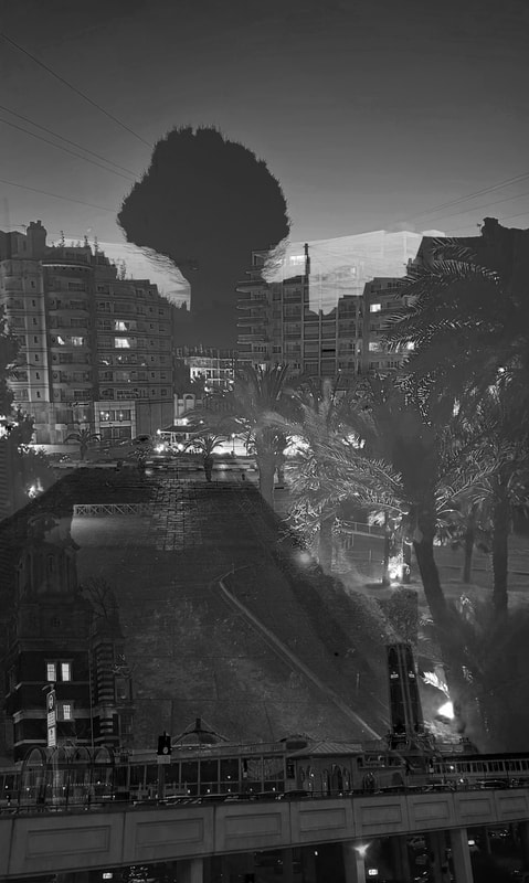
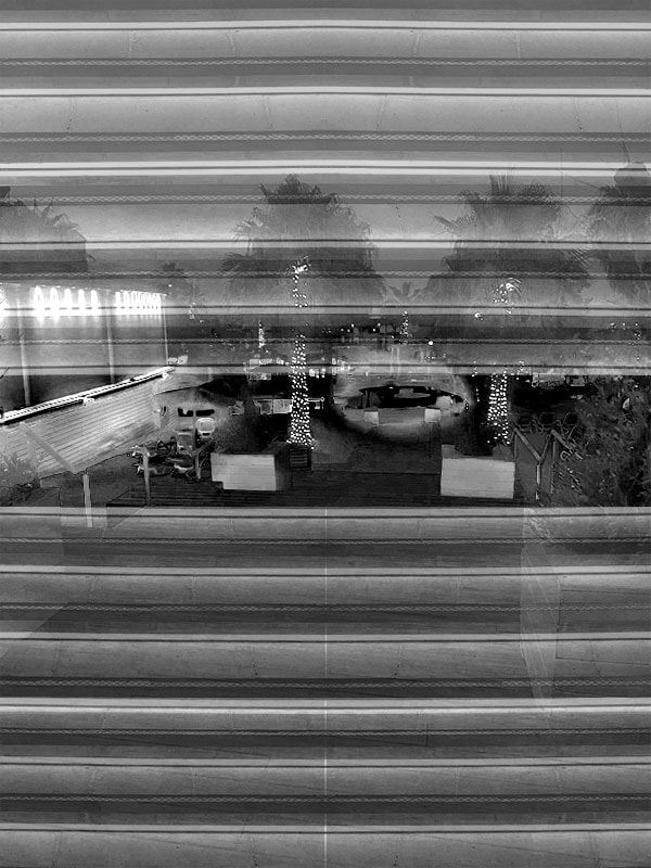
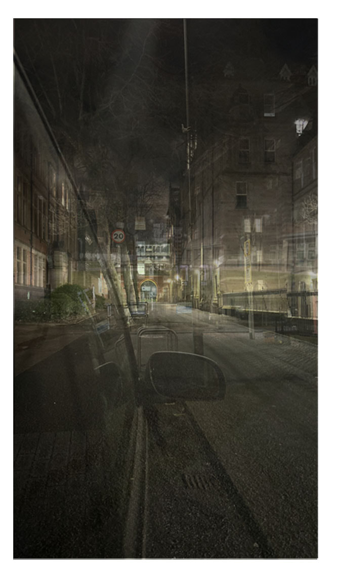
For this outcome I got the inspiration from a new photographer called Idris Khan. He is very famous for how his images are layered on top of each other with different opacity's creating a whole new image. I liked how he did this and I attempted this myself and this is my outcome. I am really happy with how it turned out and would like to do more outcomes like this in the future with other pictures.
Outcome 6:


|

|
|
|
|
|
|
|
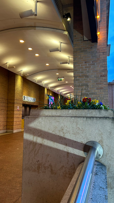
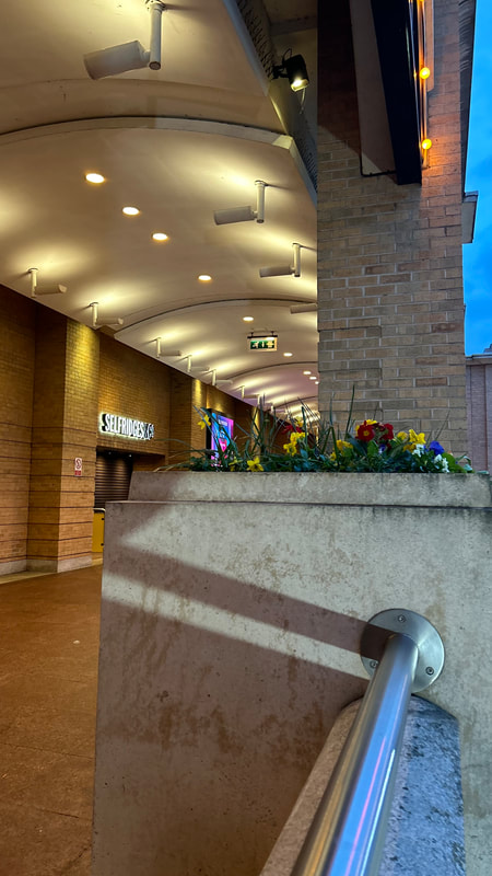
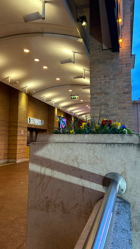
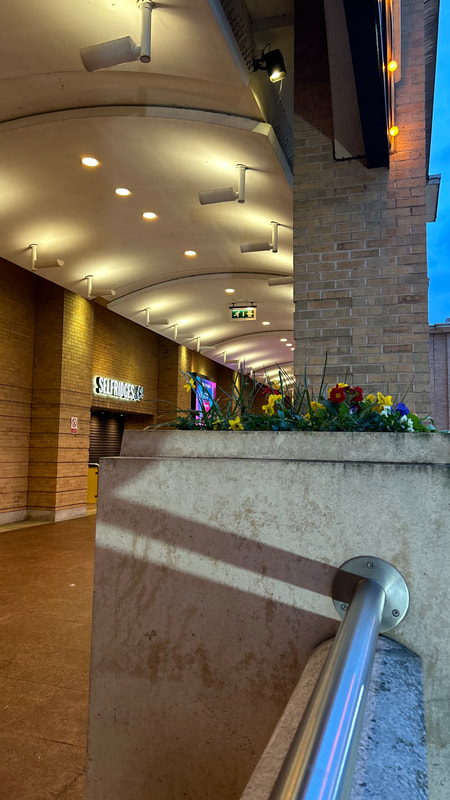
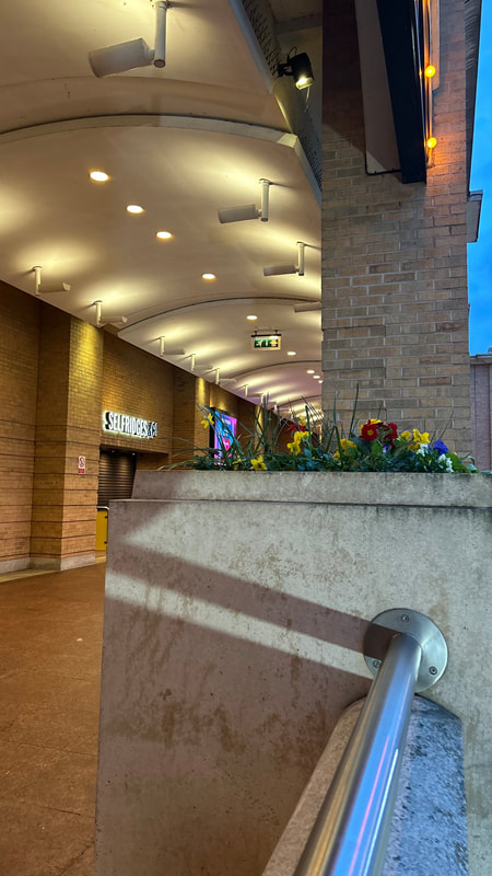
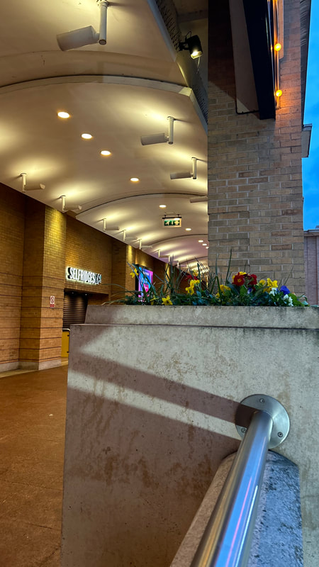
BEST:
I like how the spotlights at the top on the ceiling all lead down to the end looking as though there is no ending for the ceiling. This image has a focal point which is the flowers they are different coloured and abnormal from the colour scheme that was already going on and they attract the attention of your eye.
I like how the spotlights at the top on the ceiling all lead down to the end looking as though there is no ending for the ceiling. This image has a focal point which is the flowers they are different coloured and abnormal from the colour scheme that was already going on and they attract the attention of your eye.
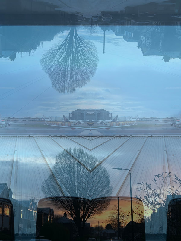
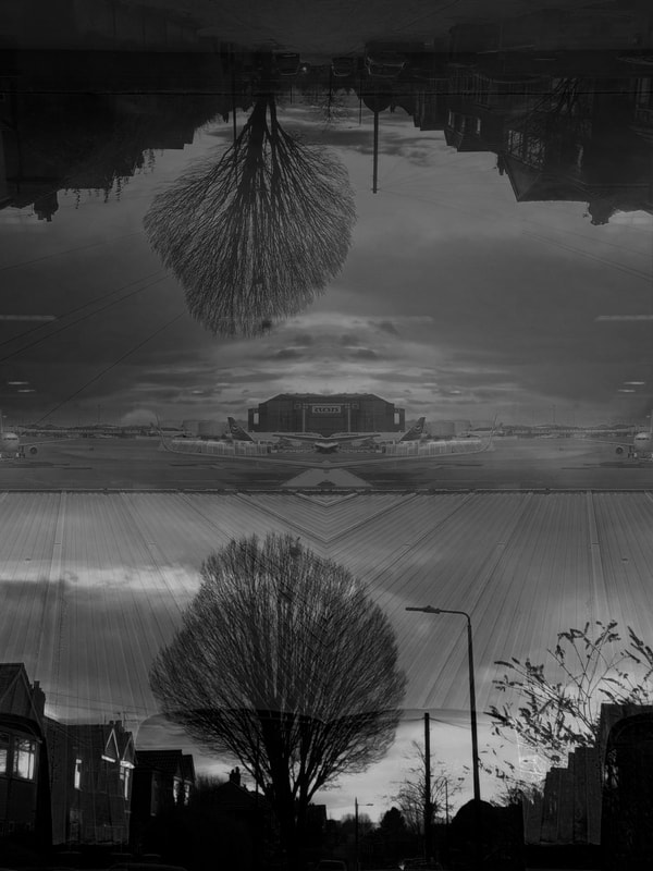
For my final outcomes I am going to be focusing on layering and overlapping images. I will also experiment with the textures and colouring of the images. I am going to do this because I feel that it works well with lowlight pictures as it makes the image look very busy and chaotic but in a good way.
Outcome 7:


|

|
Outcome 8:


|
|
Outcome 9:


|

|
Outcome 10:


|
|


Outcome 11:


I didn't like how this image was turning out as I don't think that the 2 images have any sort of correlation and so the two images overlapping each other did not look right and so I changed one of the images.


|
|
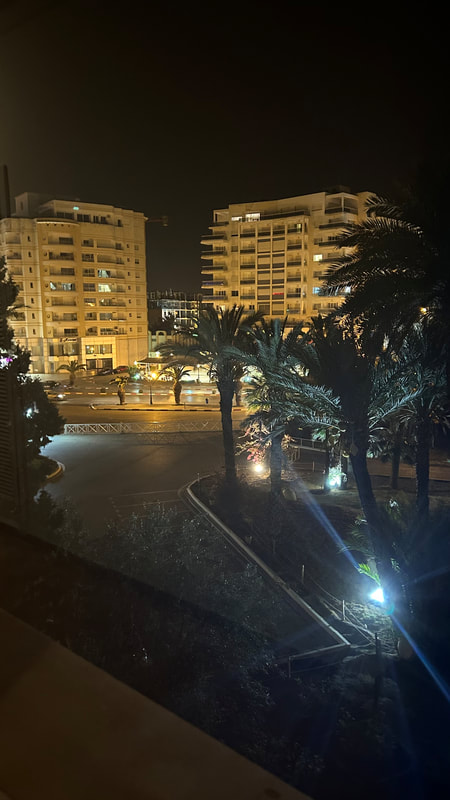
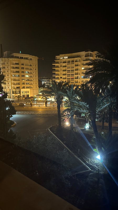
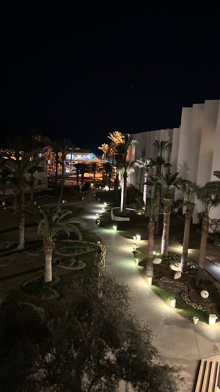
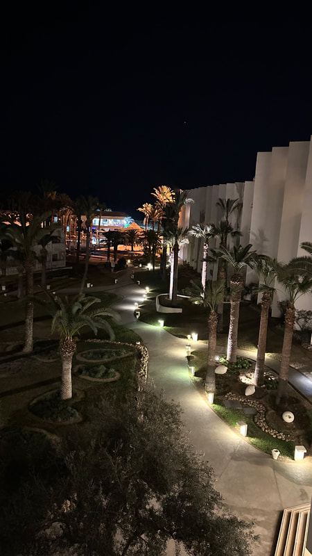
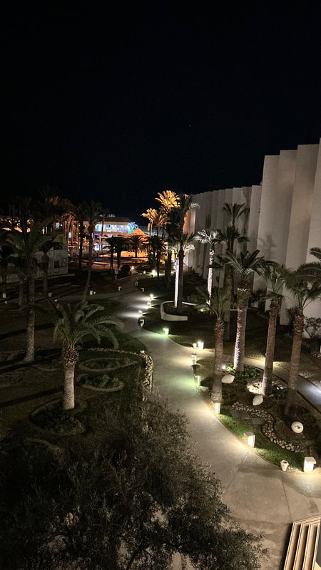
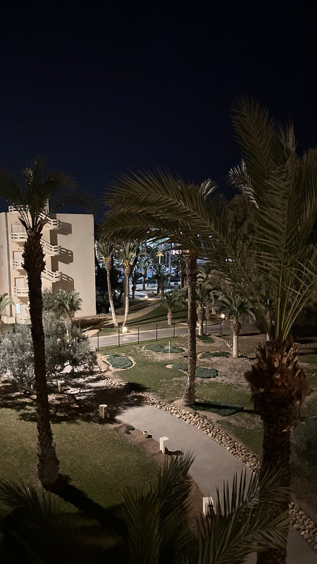
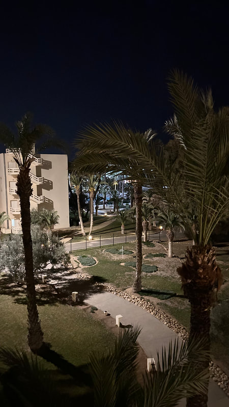
Holiday Pictures- Tunisia
|
|
|
|
|
|
|

|
|
|
|
|

|
|
|
|
|

|
|
|
|

|
|
|
Evaluation:
My main theme was low light and I explored the different types such as, low light in the day, night, snow and the inside of buildings. I thought the theme was good because I was able to take images of buildings and sunsets which was something I really enjoyed doing. Images that I liked are the winter snow ones and the images of buildings with beautiful sunsets in the background as they looked eye catching and heartwarming. Although it was a little difficult to take such images due to the fact that I was limited on where to go I can see that I was able to get really good sets of images. This allowed me to be creative and expand my skills in photography as well as my knowledge as I had to consider a range of different things before taking the images. For example the lighting, the background, the sceneries, exposure and tones. I also had to make sure there were no distractions that could ruin the image as most of the pictures I have taken were set in public places and so it took a long time to get a clear shot of the view .
In photography as well as taking the image I found the use of Photoshop very interesting as it allowed me to manipulate my work and improve the images I took. As well as this it allowed me to expand my creativity and skills and present them in my work. I enjoyed the fact that I got to go out and explore and do lots of location shots rather than being in a class or taking studio shots. It felt more real and natural to take pictures outside. I found that with low light it was hard to define what it is that I initially wanted to take pictures but I eventually figured it out and I think this project worked out really well .
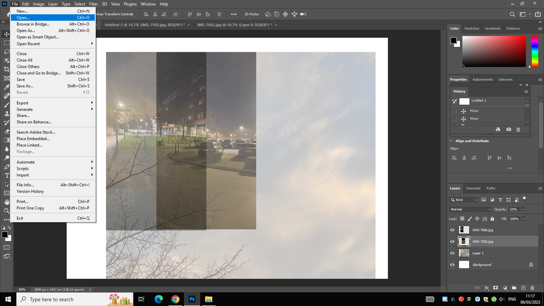
New things that I have learnt are copy and pasting layers and overlapping images alongside resizing them and and transforming them horizontally. To do this I did not use any tutorials. Instead I searched a photographer called Idris Khan and loved his work. I then set out to figure out how to overlay my images and size them to the correct proportion. To do that I googled the things I didn't know how to do and adapted it all into my own set of instructions and followed them throughout the following outcomes.
I wish to have been able to develop more of a skill in photo-shop like experimenting with shapes and transforming pictures into something more unrealistic.
I had researched 4 amazing photographers. Bill Shwab was important in motivating me towards taking pictures of buildings and also presenting my pictures in black and white I really liked his perspective and how he showed a sense of caution in his images. Liam Wong's pictures inspired my first gallery of neon pictures. His work helped me and led me in a direction with those pictures which were a success to my project and which I feel really showed the neon and bright coloured theme to low light. Jan staller helped to influence my winter pictures as well as my pictures with the captivating skies. I loved how her images looked so surreal and almost perfect. I used her work for inspiration and adapted it to my own personal project and took pictures along the lines of hers as well as adding my own touch. Idris Khan was very important in helping to develop my images further in photo-shop. His work of layering and layering inspired me to do the same but I adapted his work and instead of layering the same photo over and over again I layered different pictures on top of each other which looked really good and added to my project.
I really enjoyed Photoshop and going out to different locations. The best tool I used was the colour adjusting tool. because in my opinion it gave me a good outcome and also grew my confidence in my pictures. It was also really useful in helping to turn my pictures black and white Bill Shwab and Idris Khan.
I feel the most successful part of my project was my photo-shop outcomes and my pictures with the sunset backgrounds. My photo-shop outcomes really helped to boost my project and make my work look very interesting. I am so happy with my outcomes and feel thrilled to say that those are my pictures.
One thing I did struggle with is the lack of places I could find to get the perfect low light pictures which is why I feel I do not have enough pictures on my website as I should have. One problem I also faced was finding it difficult to find similar images that would match or correlate with each other as there wasn't a large spread of images. So my lack of photos created a problem in my work but it was nothing that I wasn't able to overcome. In the end i was able to resolve my problem and was able to create a solution.
I mainly learned by doing trial and error and with help from teachers. I feel this was a great way to learn as it allowed me to be open and creative with my work and explore more. I first started off by changing the textures of my images and the colouring. I played around and realized that, that is not what I wanted to do. I then started doing some research and that's when I found Idris Khan and started developing my work similarly to him by incorporating some of my own ideas too.
If I had the chance to go back and do my project again I would incorporate more location shots into my journey and also try to research more photographers that share similar outlooks with Idris Khan.
21st April, first exam, I will not add any more information or make any changes to the work above.
Outcome 1+2:


|
|
I am not to keen on the first outcome for this edit as the pictures don't match with each other and so the image looks strange and really random. The 2nd outcome is better but still I do not like it as the pictures being layered in that way adds random lines making the ending outcome look confusing.
Outcome 3+4:


|
|
I prefer the colured outcome in this instance as it adds more to the picture and you can clearly see what relates and the lighting is perfect for low light.
Outcome 5+6+7:


|
|
|
Outcome 8+9:


|
|
Outcome 10:


Outcome 11+12+13:


|
|
|
Outcome 14+15:


|
|
Outcome 16+17:


|
|
Outcome 18+19:


|
|
Outcome 20:
   |

|
Outcome 21+22+23:


|
|
|
Practical work:


Final Gallery:
|
|
|
|
|
|
|
|

|

|
|
|

|
|
|
|
