Statement Of Intent.
My project theme is texture and I hope to use a wide variety of textures, such as flowers, shells, bark, food, woods. I may also contrast this with man-made textures, such as bricks, metal, cars, so that I can explore a wider range of textures and compare and contrast them. Texture is the design of an object and how it looks and feels. All objects have a different type of texture which makes it easier to take images of things.
For this specific theme I am going to be focusing on 3 photographers, Edward Weston, Audrey Ann and Sandra Bartocha. The images they have on their websites show the different angles of many objects and the texture on the surfaces and I love how professional they are and how much skill they have and the amount of concentration they put into their work. All 3 of them have done many amazing photoshoots, for example Sandra Bartocha has done a photoshoot in the woods where she focuses on many different techniques like the rule of thirds and you can also tell that she has really considered her lighting throughout her collection of images. Their work is quite inspiring and makes me want to do more to be a photographer like them. Edward Weston is best known for his carefully composed images of natural forms and landscapes.
For my initial research I will be making mood boards and mind maps on different textures to help me expand my research and it will also make it easier for me to concentrate on one sort of theme as I will have something to stick to. I will also learn how to use a camera professionally by learning how to change the lens and use different lighting techniques. I intend to complete many photoshoots on many different man-made and natural objects capturing the texture of them.
In the future I intend to take pictures of more natural things like sunsets and skies and many more beauties of nature, for example trees, flowers, rivers and much more. I am going to experiment by learning how to use a camera professionally, both in studio shoots and out on location. I will be able to learn how to set-up the lighting when taking studio shots and how to capture the natural light when shooting outside. I also intend to try different lenses, such as a telescopic lens so I can see the close-up detail of texture. I will also be editing my images on photoshop to make them look more interesting and perhaps upgrade them.
To show my work professionally I have built my own photography website using a software called Weebly, this task was not as hard as it was user friendly and straightforward to use. . At first I was experimenting with it but I eventually figured it out. With the images that I end up with I will upload them into a gallery and analyze which are my best and worst images, learning from the experience. I shall do it this way as it will look professional. On my website I am going to upload all of my content and many glimpses of my photography journey. I will also have a progress tracker on which all of my progress will be shown and I will comment on my own findings and what I learn throughout my journey.
I wish to learn all the skills and techniques there are in photography to make me a better photographer as I would like to pursue the opportunity of being a photographer whether it be full time or part time. It would also be an amazing opportunity to travel the world and it is an opportunity to explore the different sceneries of the world and destinations. For example I really want to visit Paris to explore the wonders and the tourist attractions like the Eiffel tower or The Cathedral Notre-Dame as these are amazing places which have great opportunities to take photos.
Mood Boards:
Manmade:


Natural:


Coggle:
Edward Weston Research:

Composition:
This beautiful image was taken by Edward Weston in the 1950's. When taking this image Edward must have had a lot of things to consider as back in the 1950's it was harder to take pictures as the camera settings had to be set manually. One thing that I believe is really obvious about this image is that it is in black and white.
The impact of this is it enhances the veins of the cabbage and brings out the texture and that's because the contrast of grey, black and white makes it stand out. The photographer has lit the light from the bottom right so it makes it look 3D and it is subtly lit. In the background you can tell the photographer has used an infinity curve and so the background is all clear and the fact that the background is black blends in and makes it stand out even more.
The image is quite tightly cropped. My eye is drawn to the right side of the cabbage as the ends of the cabbage are frilly and so the texture stands out. The image has quite a shallow depth of field. In my opinion i think that this image was shot in a studio. The IOS of the image was at around about 200-400 and the white balance was set to match the lighting. In my opinion although the photographer hasn't used a rule of thirds I can still see a bit of symmetry.
Context:
I have done a bit of research on Edward Weston. The information I have acknowledge is from the website below.
https://edward-weston.com/edward-weston/
"Edward Henry Weston was born on March 24, 1886, in Highland Park, Illinois. He spent the majority of his childhood un Chicago where he attended Oakland Grammar school. He began photographing at the age of sixteen after receiving a Bull's Eye #2 camera from his father." "Weston’s first photographs captured the parks of Chicago and his aunt’s farm. In 1906, following the publication of his first photograph in Camera and Darkroom, Weston moved to California. After working briefly as a surveyor for San Pedro, Los Angeles and Salt Lake Railroad, he began working as an itinerant photographer."
Connection:
This image is also of a vegetable and also focuses on the texture of the cabbage leaf. Similar to the images I have taken, this is important as it fits in really well with my images and looks natural. I like the way that the photographer has taken this image as he has really considered all the techniques when it comes to taking pictures and it is really important to consider all the things as it has a great impact on how the image is portrayed.
Comment:
I think that the meaning behind this image is you can see how hard Edward must have worked to get this shot and so it shows his perseverance and his great skill and passion for photography . One strength that I could easily point out about this image is the texture of the cabbage is really visible and clear and so it helped to show the cabbage off. However all images have at least one weakness and in this image that weakness is that perhaps he could've added another light or brightened the lamp he used so that there wouldn't be as many dark patches as although it looks nice it may have been better if the patches of darkness were lighter and more visible. I really like this image as it brings out the shape and quality of the cabbage is clear and the use of the greyscale colours makes it much better.
Audrey Ann:
Composition:
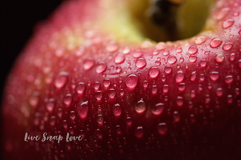
This wonderful image was taken by Audrey Ann a not very well known photographer who has her own website called "live snap love". Audrey has really thought about her angle and considered the rule of thirds. The texture of the apple is very blatant. The colour of the apple looks more like a colour scale from dark fred to light red and then with a hint of green at the top. The droplets on the apple really pop out enhancing the shape and texture of the apple.
Audrey has really concentrated on the water drops. As in some aspects of the apple the water droplets are blurred making the droplets in the middle really stand out which creates a great effect. Then the droplets at the front of the apple are more clear and well detailed showing the texture of the apple and all the little pigments of the fruit.
The lighting has been angled at a very clever place to kind of give the center of the apple a bit of a spotlight.
The rule of thirds has carefully been proportionalized, the top third has been lit up where as the bottom third has no light and looks dark almost as if the part of the apple in the bottom right corner is black. The fact that it has been tightly cropped enhances the apple and places our concentration on the water drops of the apple. The shallow depth of field causes us to only be able to see the very front on the apple in focus.
Context:
I have done a bit of research on Audrey Ann. The information I have acknowledge has been slightly tweaked by me but is mainly from this website: https://www.audreyannphoto.com/about-me
"Audrey got started with photography in 2009, pretty much the same time as her son was born. Like many parents before her, she wanted to bottle up the sweet little things that her son did (not to mention those little chipmunk cheeks and teeny toes!) Photography became a creative outlet, something that was just for her but also something that she could do with her son. She also ended up making a living out of it, she also feels that all round it’s been the best darn thing she has ever done When not doing anything photography related, you can find her dancing to 90’s music and calling it cardio, settling down with a psychological thriller, or watching lots and lots of TV."
"Audrey got started with photography in 2009, pretty much the same time as her son was born. Like many parents before her, she wanted to bottle up the sweet little things that her son did (not to mention those little chipmunk cheeks and teeny toes!) Photography became a creative outlet, something that was just for her but also something that she could do with her son. She also ended up making a living out of it, she also feels that all round it’s been the best darn thing she has ever done When not doing anything photography related, you can find her dancing to 90’s music and calling it cardio, settling down with a psychological thriller, or watching lots and lots of TV."
Connection:
This image is also of a Fruit and also focuses on the texture of the water drops on the apple. Similar to the images I have taken, this is important as it fits in really well with my images and looks natural. I like the way that the photographer has taken this image as she has really considered all the techniques when it comes to taking pictures and it is really important to consider all the things as it has a great impact on how the image is portrayed.
Comment:
I think that the meaning behind this image is for Audrey to show off the skills she has and to show how she can really capture the image and the drops of water and make it look as if your actually physically looking at the apple. One strength that I could easily point out about this image is she has used the aperture at a high setting and that has determined the exposure of the apple and she has used an ambient light shining from the top left corner highlighting the drops of water on the apple.
Sandra Bartocha Research
Composition:
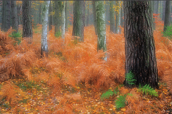
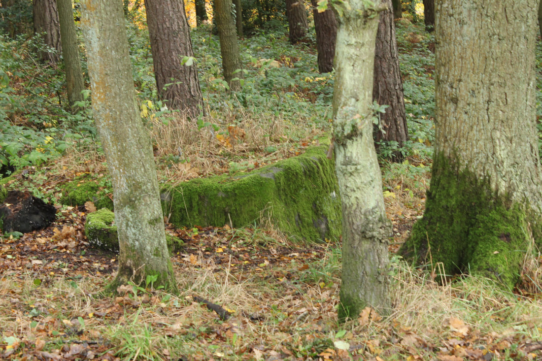
The photograph seems fairly new as it seems that it has been taken on an advanced piece of technology due to the clear capture of the scenery and the trees. This most likely would require the use of a modern camera to capture this effect as it is a more complex subject compared to older cameras which do not focus on these type of details in such depth. In the foreground of this image there is a big tree that really stands out highlighting the texture of the tree bark and really defining the pattern. Its almost as if just by looking at the picture you know what the bark feels like and realise its rough features. There are also many strong leading lines as you can see from the sides the lines lead up to the punchy green fern.
You can also see that Sandra has used the rule of thirds as on the right side a third of it has a sweet spot where the green fern is really popping out and the texture of the bark on the tree is really visible and you can see every little detail whereas when you slowly go across the image to the left side the trees and the golden orange bracken start to fade out. In my opinion the lighting of the image is a very soft lighting which makes it look as though it was taken in the early evening this is because there are no harsh shadows visible and so it gives it that magical effect. This image was taken from a forward looking perspective as the top of the trees have been cropped off so it makes it look as though you are going to enter the woods. The tree in the foreground frames the image and the rule of thirds is also used to give a deep depth of field, the bracken is in two thirds with the pale grey background in the top third of the image.
You can also see that Sandra has used the rule of thirds as on the right side a third of it has a sweet spot where the green fern is really popping out and the texture of the bark on the tree is really visible and you can see every little detail whereas when you slowly go across the image to the left side the trees and the golden orange bracken start to fade out. In my opinion the lighting of the image is a very soft lighting which makes it look as though it was taken in the early evening this is because there are no harsh shadows visible and so it gives it that magical effect. This image was taken from a forward looking perspective as the top of the trees have been cropped off so it makes it look as though you are going to enter the woods. The tree in the foreground frames the image and the rule of thirds is also used to give a deep depth of field, the bracken is in two thirds with the pale grey background in the top third of the image.
Context:
"Sandra was born and raised in Mecklenburg-West Pomerania. She studied media science, English and educational science in Potsdam. Her expertise is freelance nature and artistic weddings. Since 2007 she has been the Vice President of the GDT - Society of German Animal Photographers. She is also the Editor-in-chief of the magazine GDT - Forum Naturfotografie. Sandra also is the Member of the Neubrandenburg Photographers' Association and the Potsdam Photo Club." The only tool is that she uses is the camera. For her interpretation of the environment she uses the possibilities of technology to experiment with the choice of the section, shutter speed & aperture as well as multiple exposures to capture the essence & mood of a place."
I got this information from the following website: https://www.bartocha-photography.com/index.php?section=about
I got this information from the following website: https://www.bartocha-photography.com/index.php?section=about
Content:
This is a landscape of the woods taken during the autumn season which is great as it highlights the little glimpses of the green bracken. This picture is a clear shot there are no people, just nature and natural plants. It looks like a picture out of a book as it looks magical and very peaceful. The leading lines makes it look as though the woods are inviting you in to come and explore its magestical feature's. The warmth that you receive from this images makes it look more inviting.
Comment:
Looking at this photographer I can tell that she is very professional and her work is amazing but I am not very keen in this subject matter as I am more interested in matters such as sunrises and sunsets and the ocean. Although my interests are different I can still see all the techniques she has used such as cropping the image and the composition she has also really considered the rule of thirds to make her image look so magical. Many of her other images on her website really capture the beauties of nature and the amount of effort and technique that goes into it is unreal.
I will be using a manual camera and will start to develop my knowledge & skills by exploring the ISO, White Balance, Aperture and exposure. I will also learn how to use compositional techniques and different viewpoints. I am excited to begin this journey and show my creativity.
Wall


|
🠕Worst: Out of all the images I had taken I feel that this image may have been the worst. The reason for this is the saturation of the image makes the picture look too light and the focus of the image is all over the place
|
🠕Best: In my opinion this image had the best outcome. I feel this way because the contrast of the image gives it more texture and the vignette of the image brings out the colour and adds a darker tone to certain areas.
|
Wood |
|


|
🠕Worst: In my opinion I think that this image is not good as it could have been as the focus was not right causing the bench to look blurry therefore I was unable to capture the texture clearly. Also in the top right corner you can see a bit of the background behind the image
|
🠕Best: Out of the two images I have taken I feel that this image stands out more because of the camera angle which brings out the texture of the Wood but also the composition of the image makes it stand out.
|


|
🠕Worst: In my opinion I think that this image is not good as the white balance of the image was not set to the correct tone which made the image to appear much brighter and whiter.
|
|
🠕Best: Out of the three images I have taken I feel that this image stands out more because the white balance was set to a cloudy mode which changed the tone of the image and the bench is darker which also led to the texture of the bench too be really detailed
|


|
🠕Best: This image is the nicest one that came out because the texture and detail of the shape are clearly visible and show the viewer (you) how the tree wood would look in person.
|
🠕Worst: This image is the worse image this is because the white balance of the camera was changed to the wrong setting and so that caused the lighting to clash with the natural light that was already shining and caused the image to appear darker than what it actually was.
|
Screws:


|
🠕Best: On this image I used blue paper to cover the camera lens and it turned the background lighting to be blue then i turned the white balance to the appropriate setting and so it came out really nice.
|
🠕Worst: This image is the worse image as the camera focus was not very good and the image has appeared to be all blurred out and you can not see the detail of the screws.
|


|
🠕Best: In my opinion this image had the best outcome. I think this because the focus of the image gives it more texture and the background has perfectly been blurred, the image brings out the colour and adds a darker tone to certain areas.
|
🠕Worst: In this image the camera has not been focused properly and has made certain parts of the image blurry.
|
Fossil


|
🠕Worst: Out of all the images I had taken I feel that this image may have been the worst. The reason for this is if you look in the top left corner there is something which appears to be a leaf so it ruins the background image.
|
|
🠕Best: In my opinion this image had the best outcome. I feel this way because the texture of the fossil stands out and the lighting of the sun really captures the colour of the fossil.
|


|
🠕Best: In my opinion this image had the best outcome.
I feel this way because the lighting and the white balance have changed the tone to appear more vignette. |
🠕Worst: Out of all the images I had taken I feel that this image may have been the worst. The reason for this is the lighting is more brighter and makes it look blurry.
|
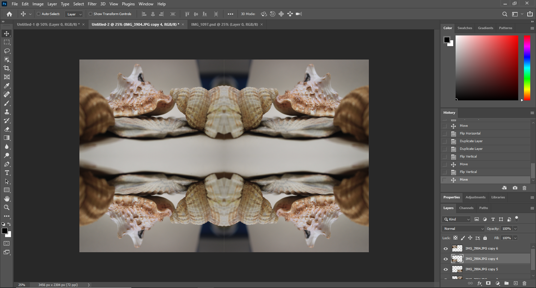
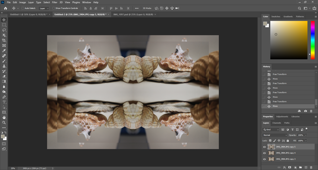
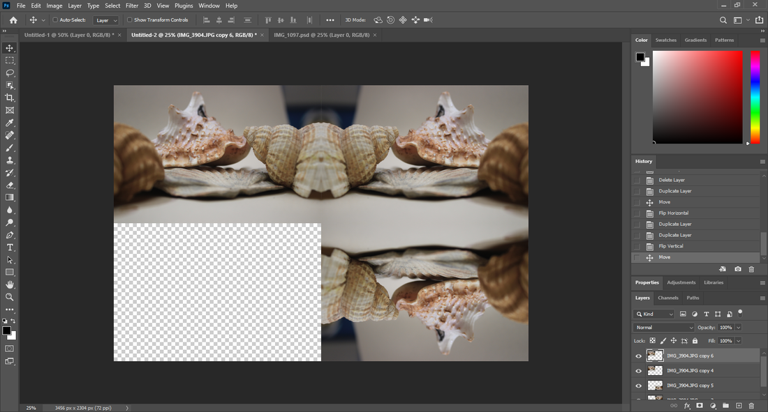
Shells


|
Best: In my opinion I think that this image is the best as the camera angle rally captures the texture and the lighting from the sun glows on the shell and makes it appear much clearer. 🠗
|
🠕Worst: This image is the worst image as its is totally out of focus and the camera has put its focus on the background instead of the shell which caused the texture of the shell to be unclear.
|


|
🠕Best: This image is the best one i have taken out of all 6 shots. This is because the angle of the camera makes the texture and detail of the shell in the back really stand out and the blur of the other shells adds that extra detail and really makes the shell look like the main character almost.
Feathers |
🠕Worst: I feel like out of all the images I took for this specific setting, this image was the worst this is because in the image the shells are all randomly scattered and there is not much organization.
|


|
🠕Best: In my opinion this image had the best outcome. It was quite hard to decide but this image just had that extra quality to it that made it stand out and that quality is the angle as it is from a high point and makes the feather look almost like fake.
|
🠕Worst: I think that this image has a few faults as these 4 images almost look identical but I think the only difference is probably the distance of the camera and the feather and maybe if the feather could have been more flat it would have been better.
|


|
🠕Best: I think that this image had the best outcome. This is because the camera was in focus and you can see the texture and the design of the tree and feather. Although this is the best image out of the four it still lacks some things and one thing that could have been avoided was the background as you can see the traffic light in the back.
|
🠕Worst: Out of the 4 images that have been taken this image is the worst and you can clearly see that the camera focus was all over the place and messed up the shot because the whole image is unclear and the real texture of the feather and tree have been ruined completely.
|


|
🠕Best: In my eyes this image looks better than the other as the angle of the camera is different an so the bench looks diagonal.
|
🠕Worst: This image is not too bad although the angle of the camera for the shot was not as great as the bench does not look right being horizontal so it makes the other image look better.
|
Leaves |
|


|
🠕Best: In my eyes this image is the best one of the bunch. This is because the natural sunlight brightens the image and really shows off the autumn colours of the leaves and you can see the texture of the leaves too even from such a distance it is still visible.
|
🠕Worst: In my opinion this image is clearly the worst image of the 6 I took. The obvious reasoning for this is because someone had gotten in the way of the shot and you can see their silhouette and so it blocks the natural sun light and creates a dark figure around only a portion of the image.
|


|
🠕Best: In this image of the leaf you can see the skin of the leaf and really see that reddish autumn colour and this makes the image stand out more.
|
🠕Worst: On the other hand in this image the White balance was set to the wrong setting and that made the colour of the leaf appear to be more white in certain areas so the image has not met its full potential.
|


|
🠕Best: I think that this image is the best one out of them all because again the colours of the leaves have really been shown clearly and the texture of the rock in the middle is clear and stands out.
|
Worst: I think that this picture has had the worst out come as the focus is not in place and the leaves have no definition or tone and it just makes them all look the same. 🠗
|


Nature |
|


|
Best: In my opinion this image is better than the other image. I think this because it is more in focus and has a clear definition with the stem of the plant at the front and blurs out the background for that extra effect.
|
Worst: On the other hand this image is slightly worse than the other. This is because I feel as though the concentration of the camera was not right and so the image is slightly more blurred.
|


|
Best: This image is clearly the better image as the focus of the camera really brings out the texture vignette of the plant and makes it stand out as the background behind it is all blurred out.
|
Worst: This image however is not as great as it could have been as it is all blurry and there is no definition of image so it doesn't look right.
|
Trees


|
🠕Worst:
In this image the sky looks all dark and grey and the setting looks miserable. |
🠕Best:
However in this image the sky looks nice and bright and the trees are a lighter shade of green. |


|
🠕Worst:
The leaves in this image have not been focused and so the leaves are blurry. |
🠕Best:
With this picture the bark of the tree is very detailed and pops out. |
Grass |
|


|
🠕Worst:
There isn't much technique that has been used and just looks like a normal image. |
🠕Best:
The grass at the front is clear and as the trail of grass goes back it starts to fade out. |
|
|
Fruit and Vegetables |
|
Sweetcorn:


|
🠕Worst:
In this image you can see outside the infinity curve and so it ruins the effect as the background being exposed defies the purpose of the infinity curve being there. |
🠕Best:
The sweetcorn looks 3D. The sweetcorn that is standing up is clear but the sweetcorn lying down is blurred a little which makes the other sweetcorn stand out. |
Oranges


Kiwi


|
🠕Worst:
In my opinion this image is the worst as at the top you can see part of the background which ruins the whole image. |
🠕Best:
I think this image is better as the texture of the kiwi stands out properly and you can see the detail. |
Pineapple


Cabbage


Tomato


|
🠕Worst:
In this image the white balance an the lighting were very off and the tomato does not look very good. |
🠕Best:
Whereas in this image the tomato stands out and the white balance is on point. |
Cabbage Leaf


Peppers


Red Cabbage


Roses:


|
🠕Worst:
I think that this is the worst one as if you look carefully at the center of the rose the camera has not focused on that area and so it has turned out to be blurry. |
🠕Best:
I think that this image us the best because the camera focus here has worked exceptionally and has captured the true texture of the petal on this rose. |


Padley Gorge
Leaves:


|
🠕Best: In my opinion this image as it really brings out the autumn colours of the leaves and the texture of the tree looks great.
|
🠕Worst: I think that the leaves in this image are not as clear and perhaps the lens was not as focused.
|


Trees:


Photoshop
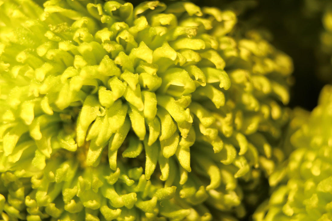
Before:

|
|

After:

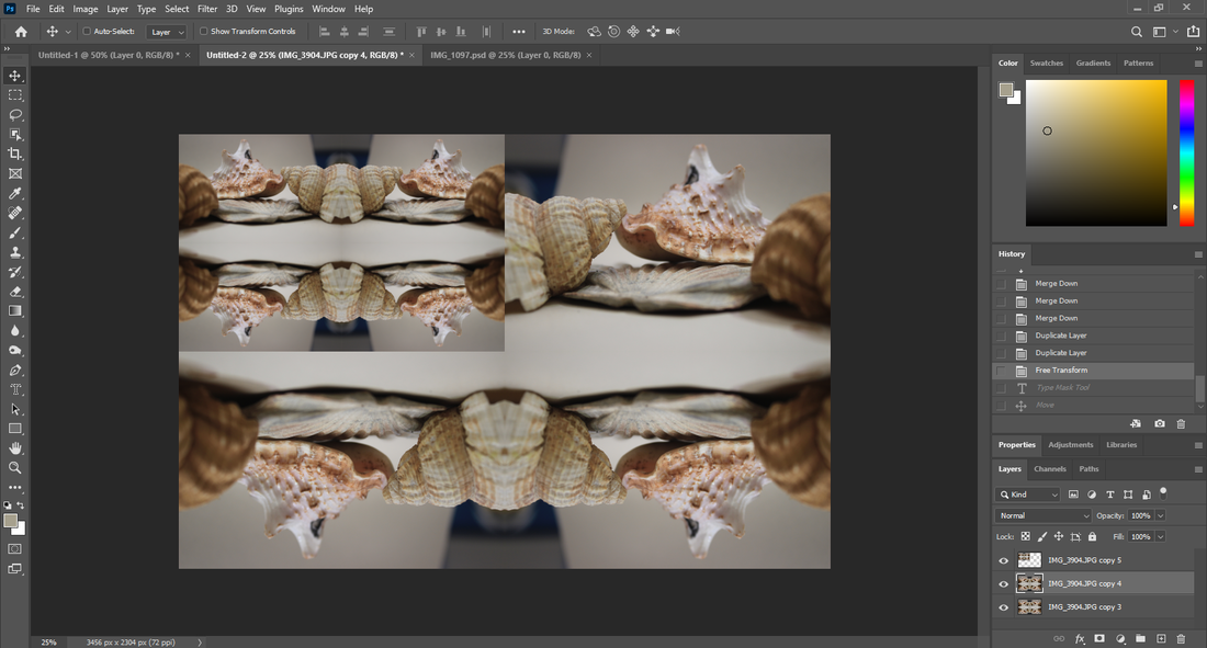
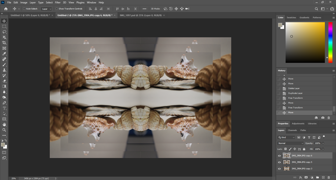
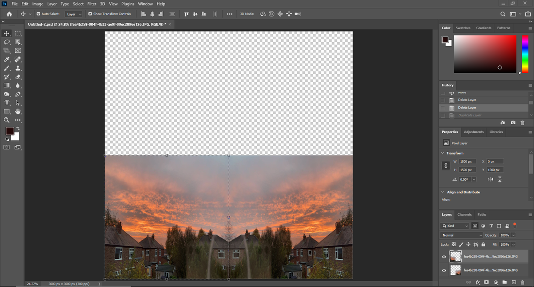
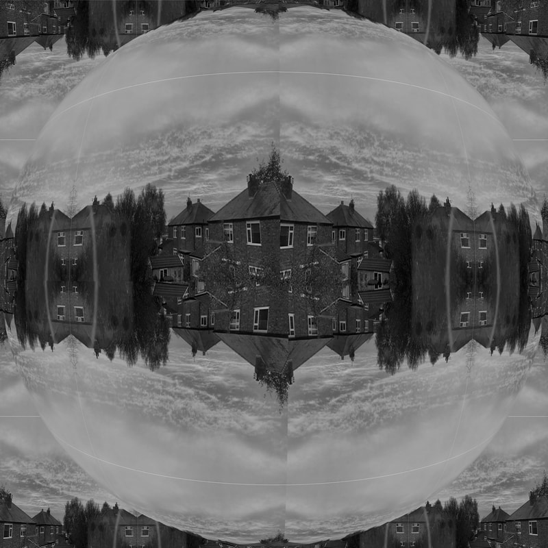
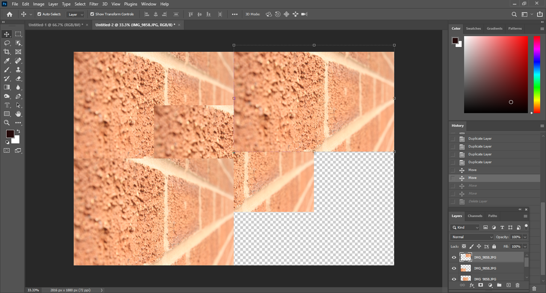
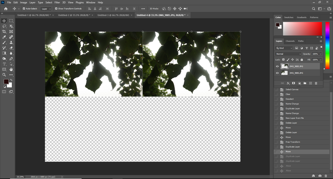
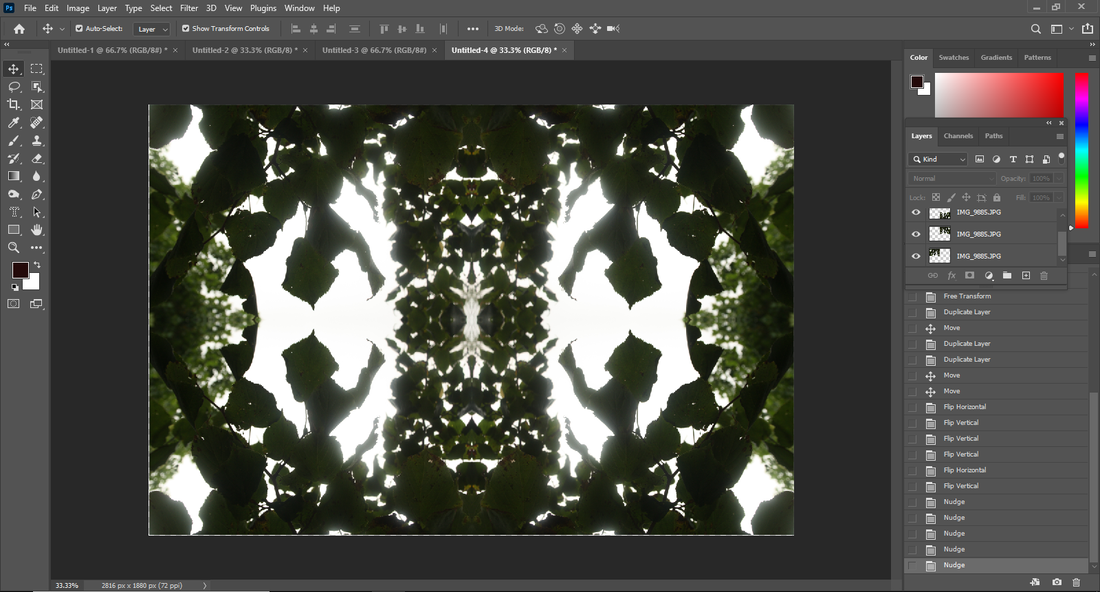
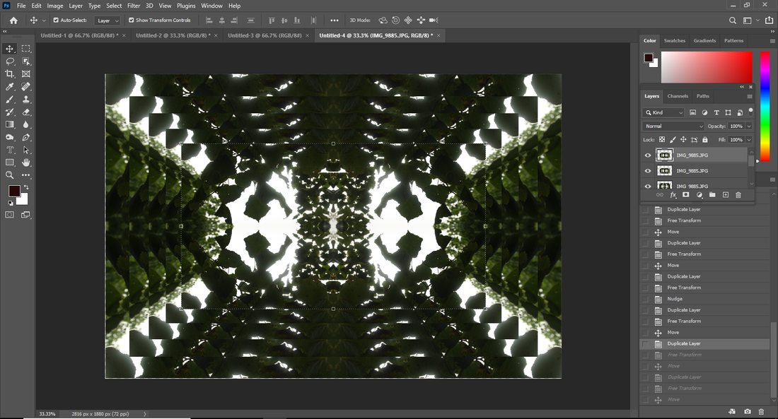
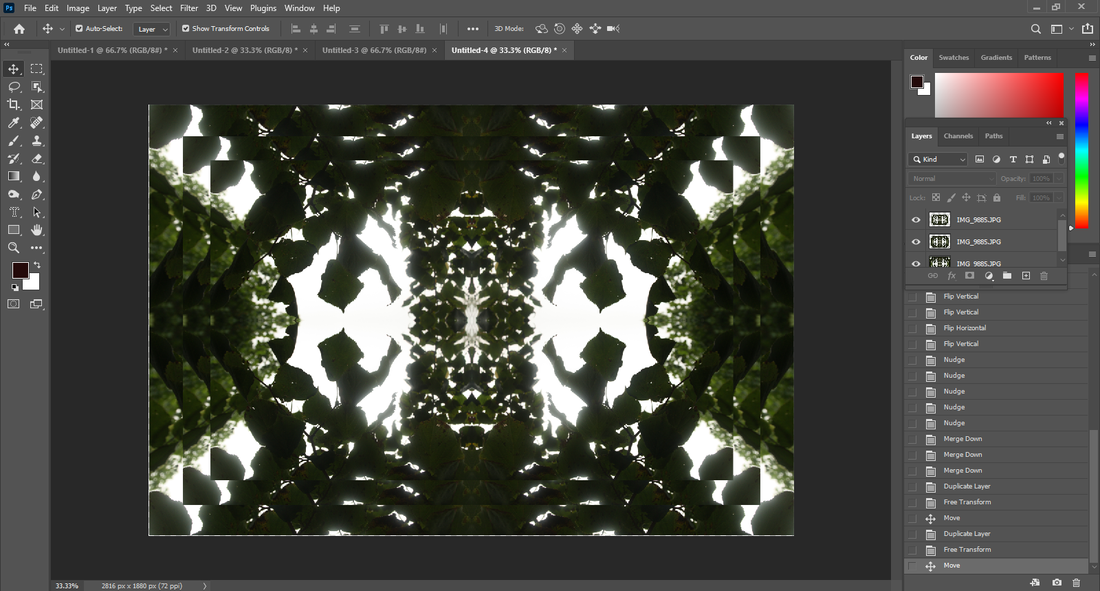
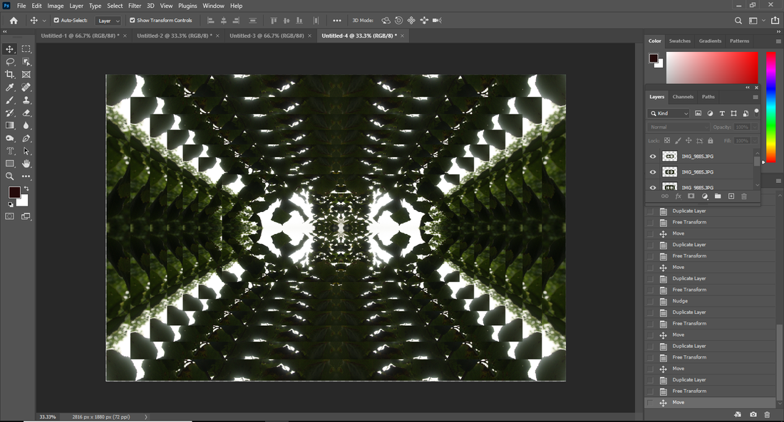
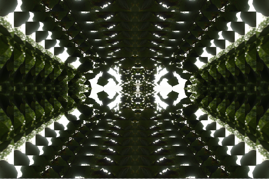
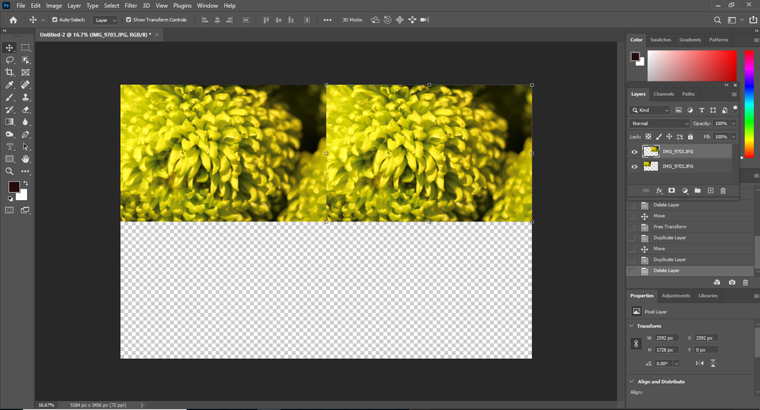
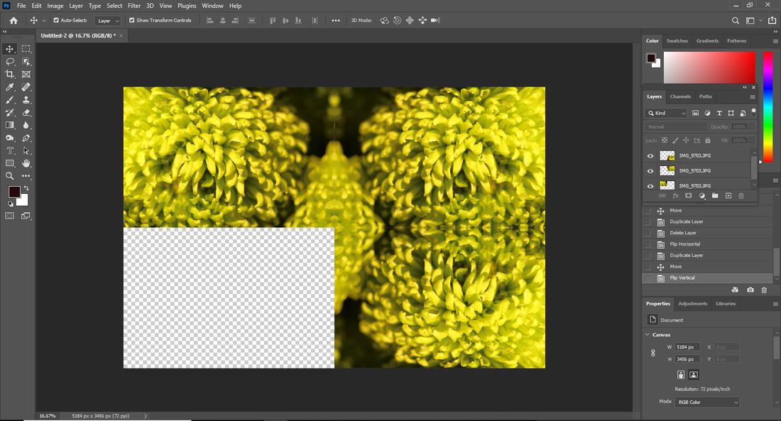
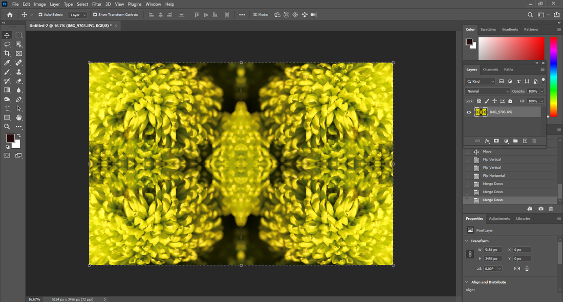
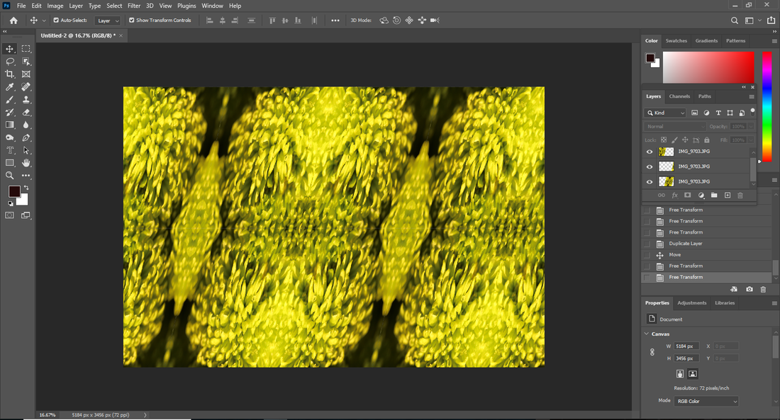
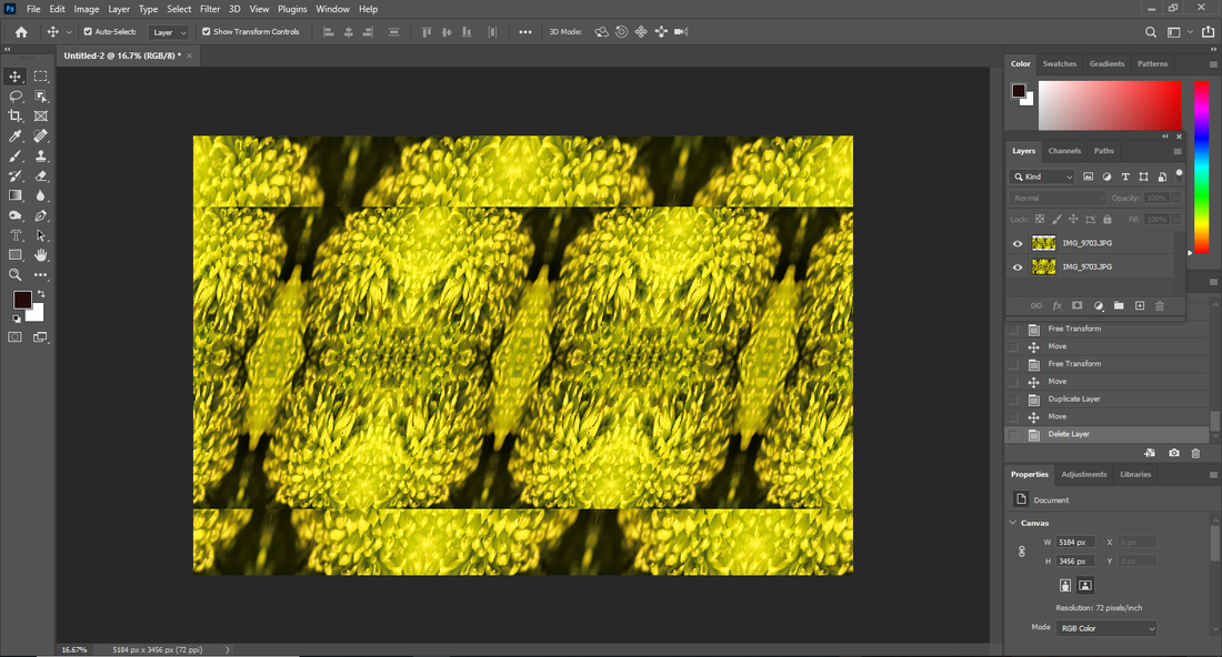
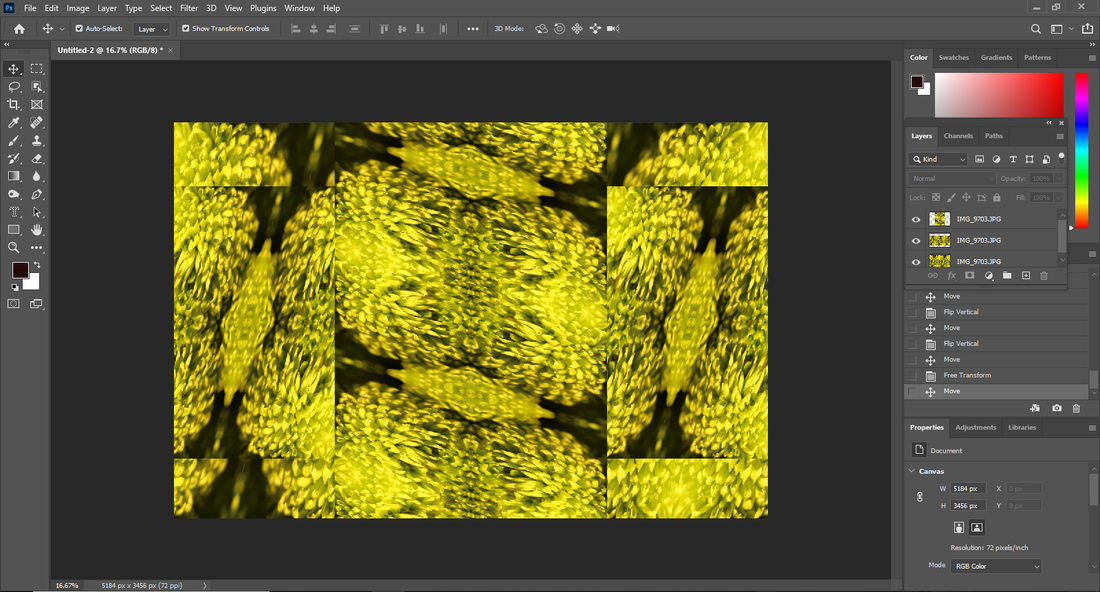
Developing in photoshop:

|
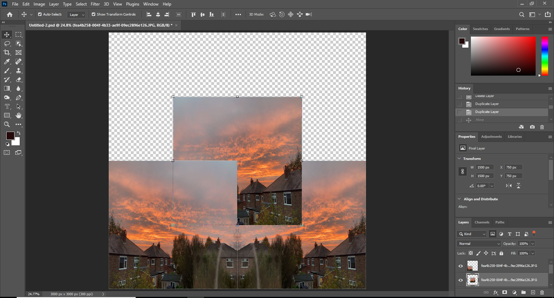
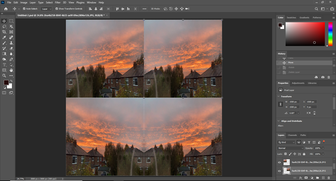
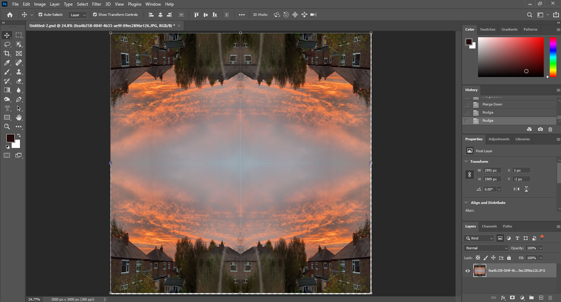
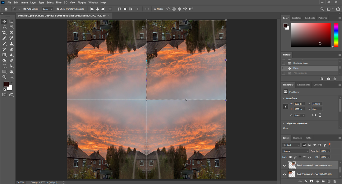
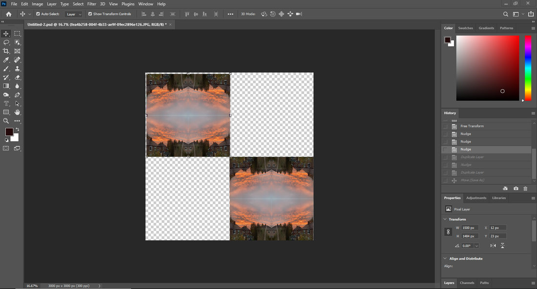
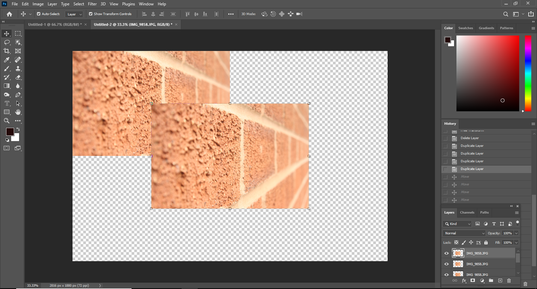
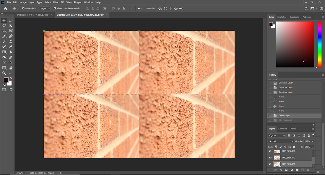
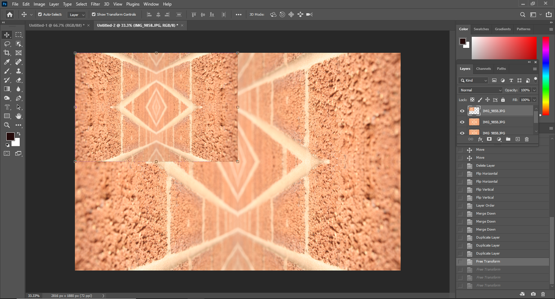
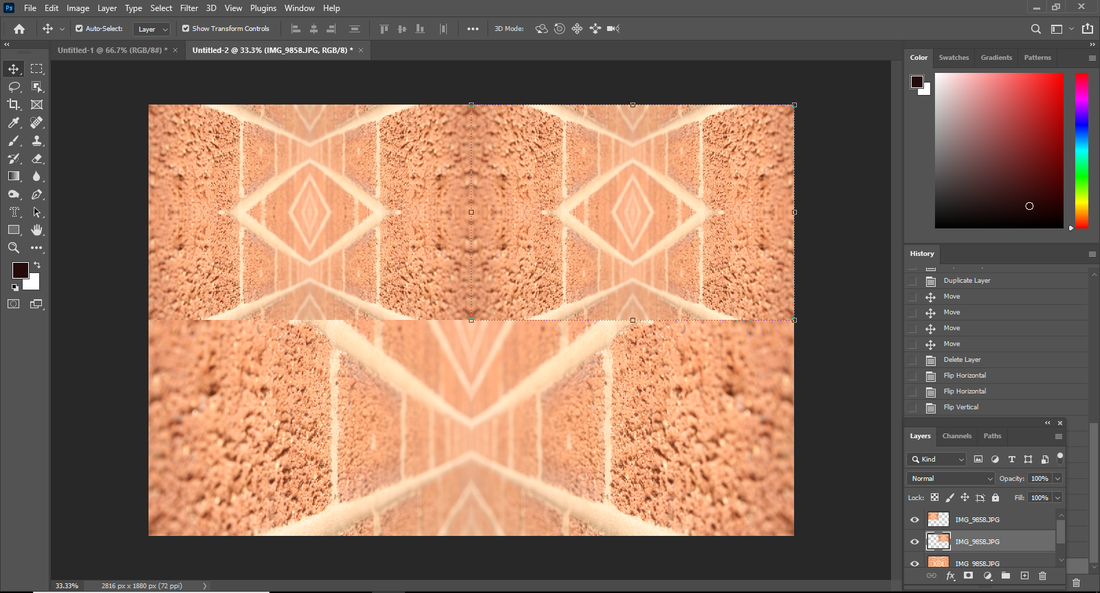
I used this video to add a galaxy background to my image to make it look more interesting. At first I was just experimenting but then I ended up making my image look more intriguing.
|
Before:
Before: |
After: |

|

|
Before:

|
|

Before:
|
|
|
|
After:


|
|
Before:

|
|
|
|
After:

Before:

|
|
After:
Final outcome 2: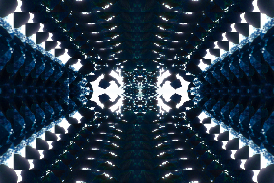
|
Final outcome 3: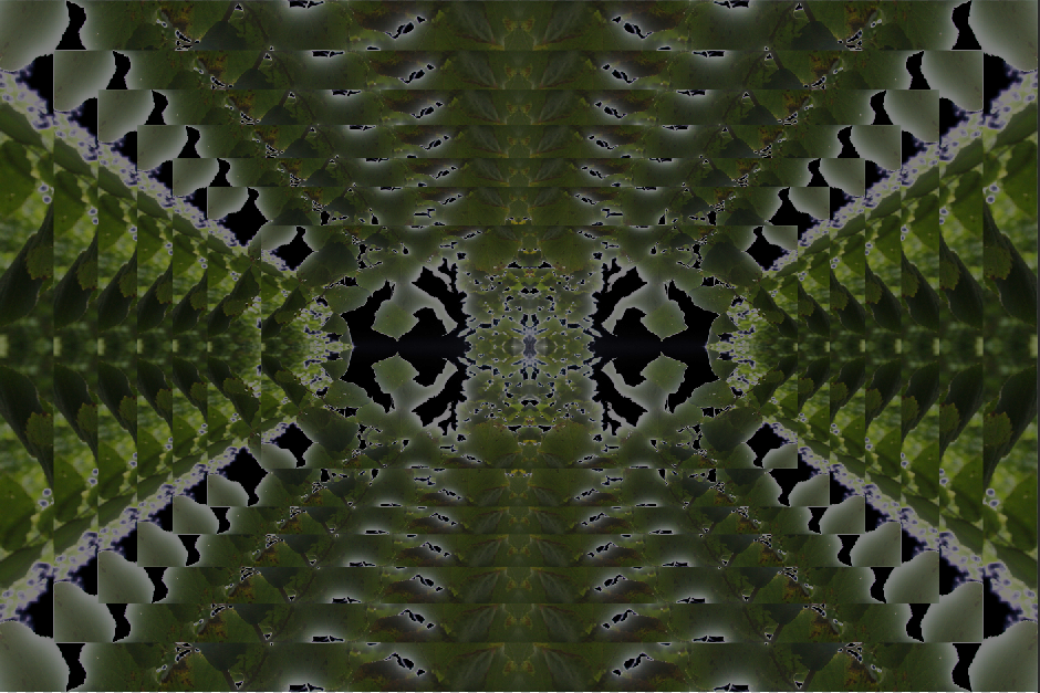
|
Before:
|
|
|
|
|
|


After:
|
|
Natures blossoms:


Natural plants:


Stones/Rocks:


River:


Scenery:


|
🠕Best: I think that this image really captures the scenery and everything is well intact and you can clearly see all the leaves and the texture of the water and stones.
|
🠕Worst: In my opinion this image was not as good as the other images because the other images are much more defined
|


|
🠕Best: In my opinion this image has had the best out come out of all 4 shots as the focus is intact and the autumn colours are shown off.
|
🠕Worst: I think that this image is the worst take as there is no focus and so it ruins the whole scenery.
|


Train Tracks:


|
🠕Worst:
This image is more zoomed in and cuts off the top of the tunnel. |
🠕Best:
In this image you get the full view of the tunnel. |


|
Best🠕:
I think that this is the best image as you can see the texture of the clouds as the camera white balance was changed to daylight to ensure that you can see the clouds. |


|
🠕Worst:
I think that this is the worst image as the white balance was was set wrong and so the clouds look bleached and look as though there are no clouds in the top left corner. |
Bubble Wrap:


|
🠕Worst:
The green and blue jewels look darker in this image and so they are not as clear. |
🠕Best:
In this image they are lighter and the lighting is in the right place. |


Metal Tree:


|
🠕Worst:
This metal tree is blurry and the bottom of it is cut off. |
🠕Best:
This tree is fully visible and clear. |
Chains:


|
🠕Best:🠕
This image is the best out of the 6 as the texture of the image is standing out and has a nice blurred effect to enhance the texture. |
🠕Worst:🠕
In my opinion this image was the worse out of the 6 as it is not as outgoing as the others. |
Final Gallery

|

|


|

|

|

|

|
Evaluation:
My main theme was different types of textures and I explored the different types such as rough surfaces like bark on trees there was also feathers and fossils. I also did manmade objects for example screws. There was also many natural objects like flowers and trees. Although I did not like the theme, I can see that I was able to photograph different objects. I prefer to take pictures of the sunsets and landscapes as I take more of an interest in them. The images I took allowed me to be creative as I had edited the images and so you would not be able to tell what the original image was. Throughout this project my knowledge and skills have improved a lot as I learnt how to edit my photos using photoshop and how to find the best angles to take my images. In photography I found the use of Photoshop the most interesting because I enjoyed manipulating my work and improving the images I had taken. Although I enjoyed exploring in photoshop I preferred to take photos as it meant I was more active and going around places taking these pictures. I enjoyed Padley Gorge very much as it meant I was able to take action texture images which really benefitted my texture project. I also learnt how to use my camera on manual settings which made it an even better experience as I was learning new things and those skills helped me to improve myself. Building a website on Weebly was something I had never done before and so I learnt a new skill which I am sure will benefit me a lot as I grow older and progress. Photoshop has allowed me to learn how to use things like a blur tool or how to add and duplicate layers and make many different types of cool designs it wasn't mostly quite straight forward but it took me a bit of time to learn how to add layers although duplicating them was easy. I used many YouTube tutorials to help me progress. On the camera I used many different types of techniques like changing the White Balance or the ISO. I would like to develop my skills more in photoshop by using a wider range of different tools and by editing the colours. For my next project I would like to learn about lighting and how to develop my shots using different types of lighting techniques. Ansel Adams, Edward Weston and Sandra Bartocha all inspired my texture images. I used their images for inspiration but then turned it into my own work and expanded my knowledge and have made a different variety of photos. For example Edward Weston's picture of the cabbage was amazing and the way he got all the wrinkles of the cabbage and used a high exposure. In majority of my work I have tried to make my images the same and look 3D. I really enjoyed going out to Padley Gorge as there was a nice sense of freshness and the leaves were autumn colours which gave the images a better outcome and this grew my confidence and made me want to explore more. The most successful part of my project is my weebly as I am really happy and proud of the way I have built my website and with great detail too and I think that the layout of my website is quite professional which makes it look much more presentable. I encountered very few problems throughout my project but I feel one problem I had was with photoshop as it took me a bit of time to get used to the techniques and grasp the ways around it. To help me overcome this I watched many YouTube tutorials and used the help of my peers and teachers. It did not affect my final images as much but it did slow me down and reduced the amount of content I was producing. If I ever had the chance to complete this project again I think I would try to expand my knowledge on photoshop so that I could produce a wider variety and perhaps improve my final outcomes.
